MOXIE
Design of a streamlined platform connecting companies with top tech and marketing talent.
Overview
About Moxie
Moxie is a global talent facilitation company connecting organizations with vetted, ready-to-work professionals. As operations scaled, the company needed a professional digital platform that could handle complex hiring workflows while clearly presenting talent to employers.
The focus of this project was to design a structured, high-clarity interface that supports how recruiters actually work — reviewing large volumes of candidates, comparing profiles, and managing hiring pipelines efficiently.
❗ The Problem
Recruiters and hiring managers struggled to manage growing volumes of applicants using fragmented, email-based processes. Comparing candidates was slow, information was scattered, and tracking hiring progress required switching between multiple tools and tabs.
Existing workflows lacked a centralized system that could:
- Present detailed candidate information in a structured way
- Allow side-by-side evaluation of applicants
- Support advanced filtering and search
- Provide a clear overview of hiring pipelines
The complexity and information density of these tasks made it clear that a streamlined, desktop-optimized interface was necessary.
🖥️ Device Strategy — Desktop-First by Design
The primary users of Moxie are recruiters and hiring managers — professionals who spend hours reviewing candidates, comparing qualifications, and managing structured hiring pipelines.
These workflows require:
- Comparing multiple candidates at once
- Reviewing detailed resumes and portfolios
- Applying advanced filters and search criteria
- Moving candidates across hiring stages
- Maintaining visibility of context while taking action
These are high-focus, information-dense tasks that benefit from:
- Large screen space
- Multi-column and side-by-side layouts
- Persistent navigation and filtering panels
- High data visibility without excessive scrolling
Outcome
The platform was intentionally optimized for desktop use, where recruiters naturally perform deep evaluation and decision-making work. This ensured efficiency, clarity, and reduced cognitive load during complex hiring tasks.
🎯 UI Objectives
The interface was designed to:
- Communicate trust and professionalism
- Support high information density without overwhelming users
- Make candidate comparison fast and intuitive
- Maintain visual consistency across dashboards and profiles
- Provide structured layouts suited for long, focused sessions
Typography & Color palette
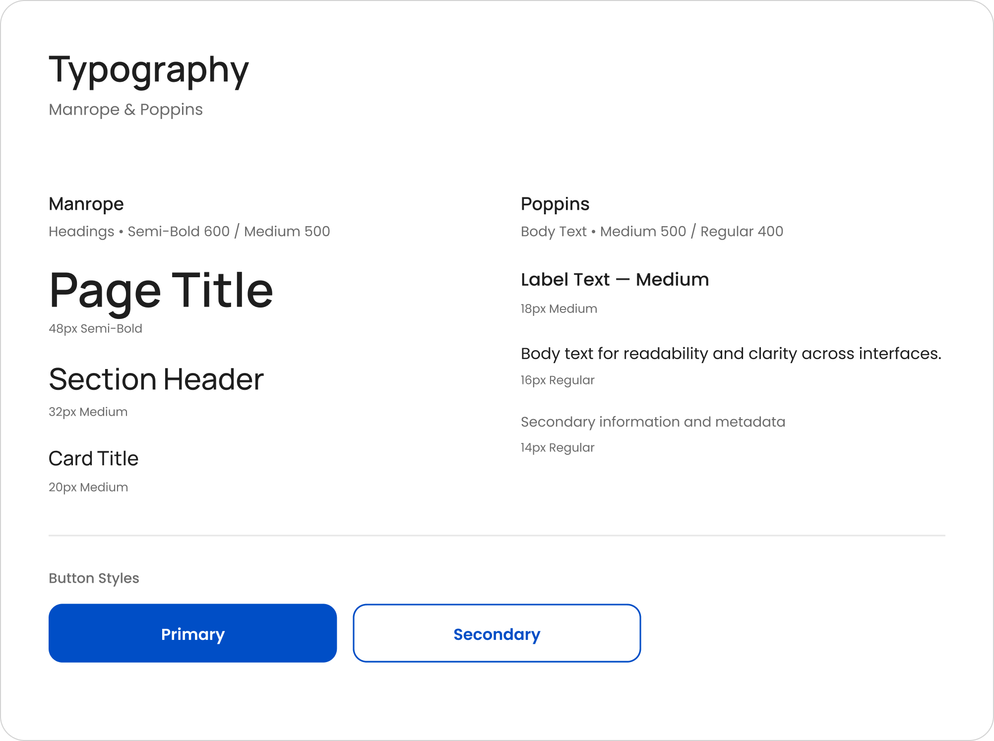
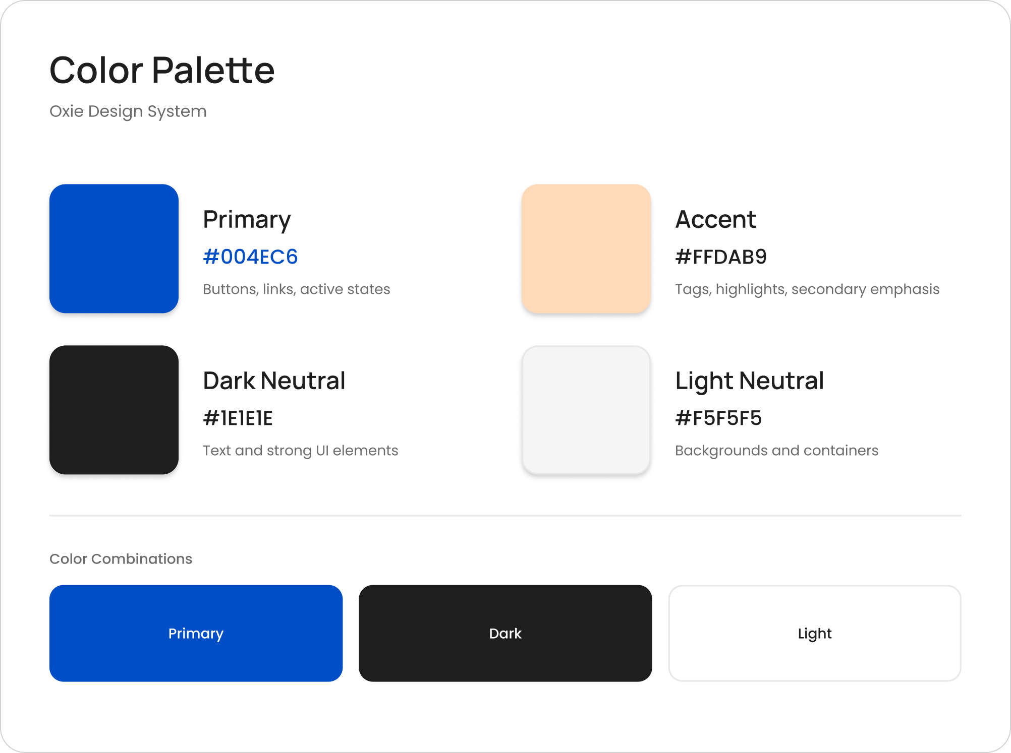
Blue reinforces trust and reliability, while peach accents add warmth without distracting from dense content.
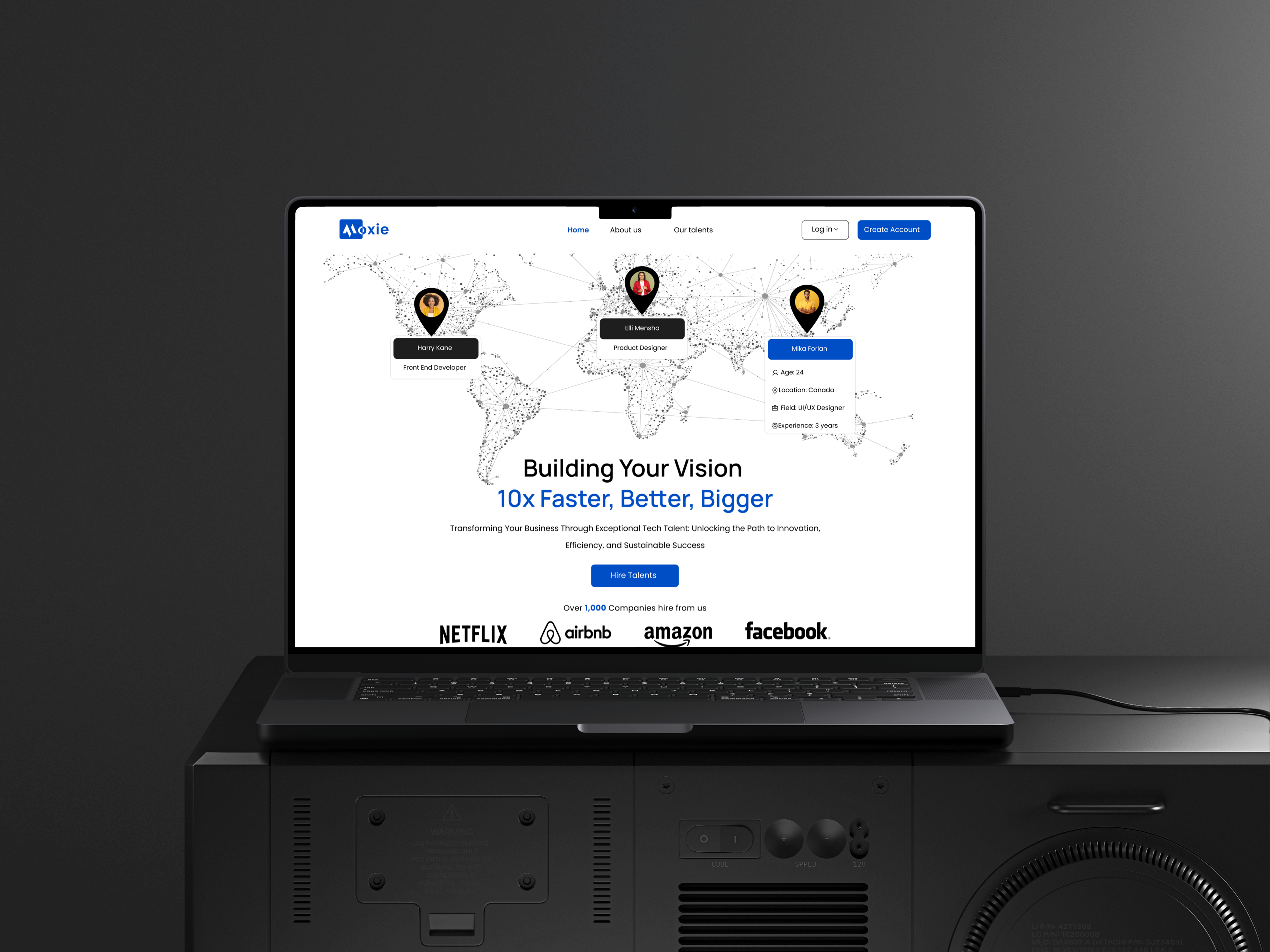
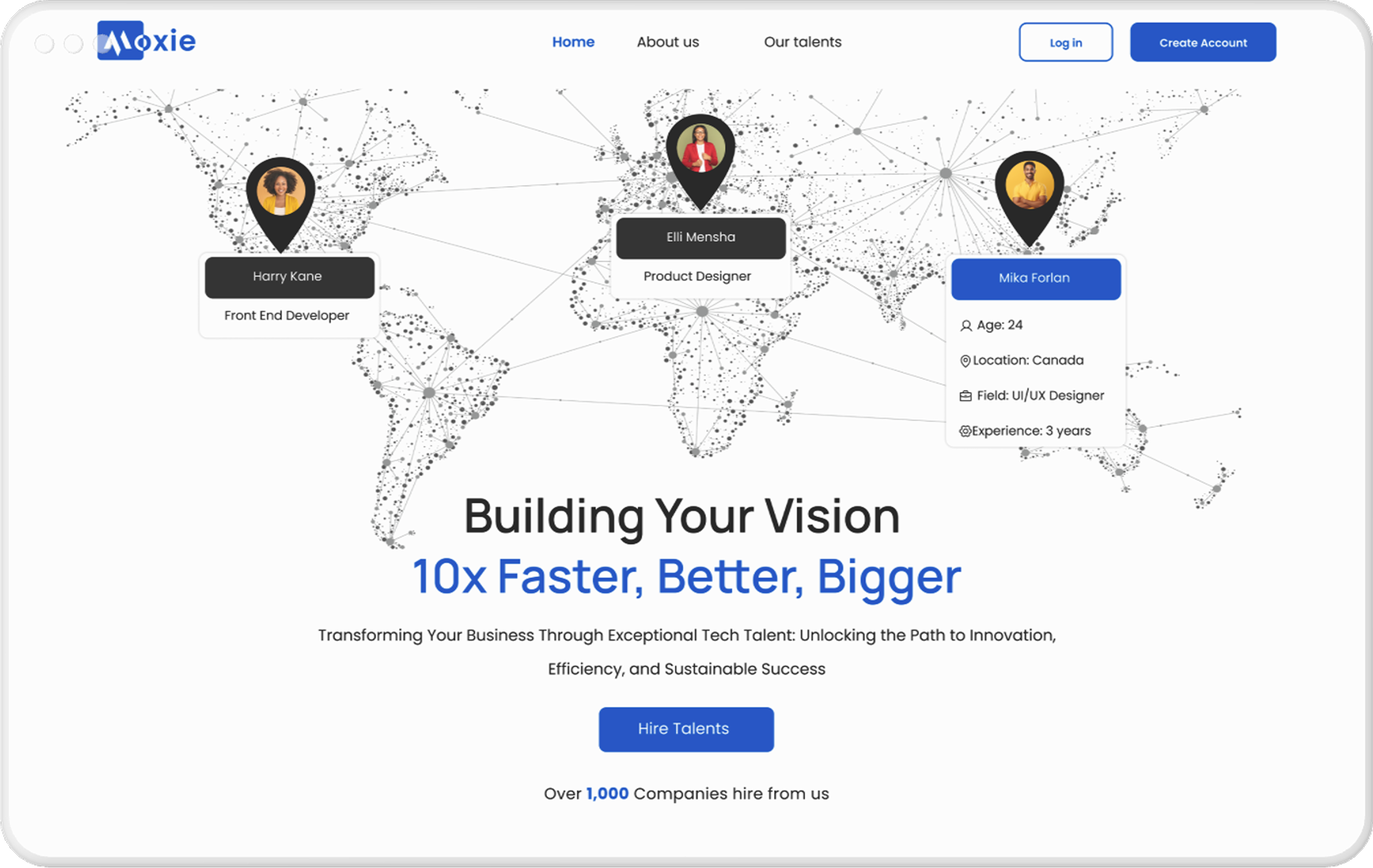
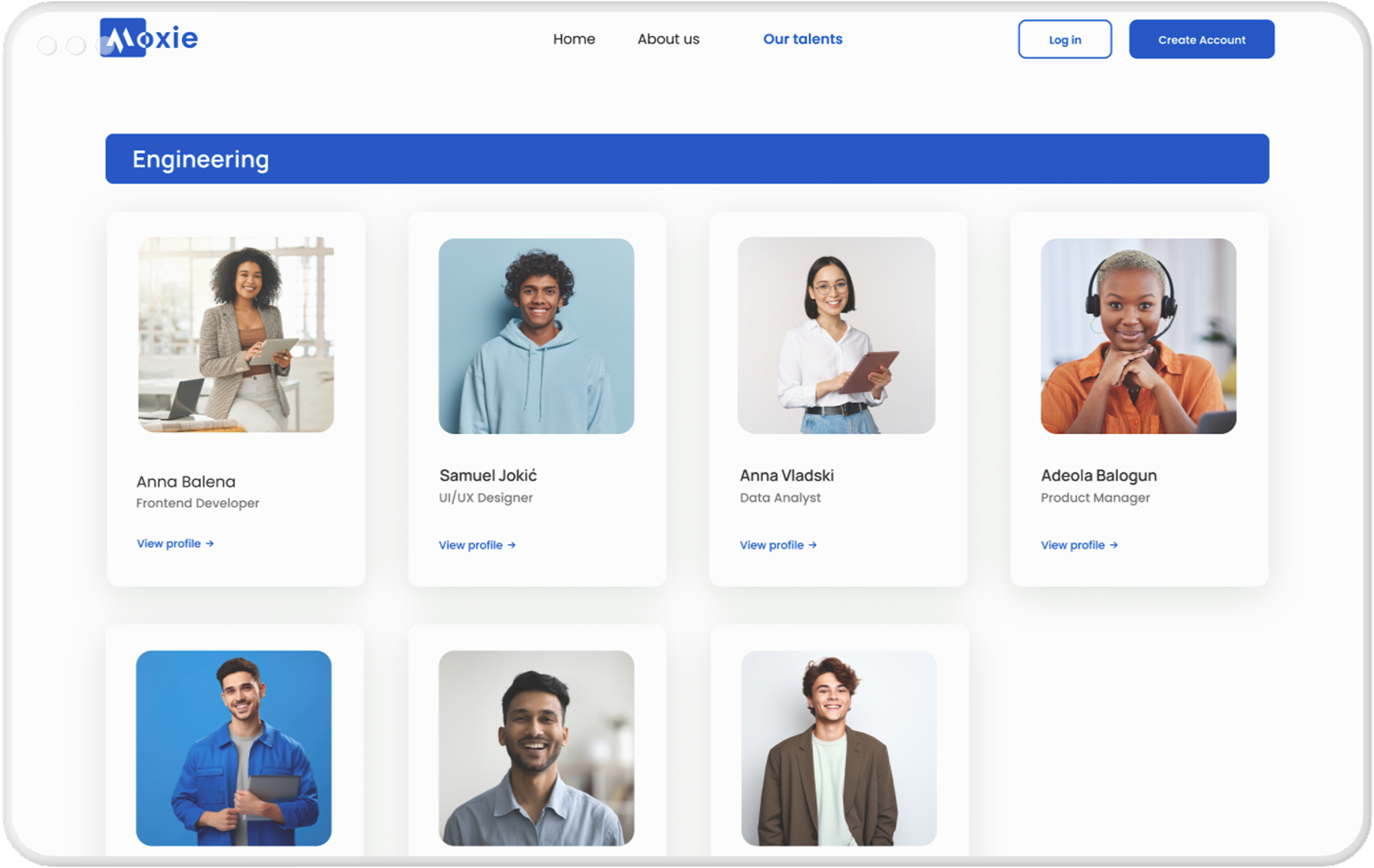
🖥️ Desktop Interface
The desktop experience was the primary design focus, supporting long, focused hiring sessions.
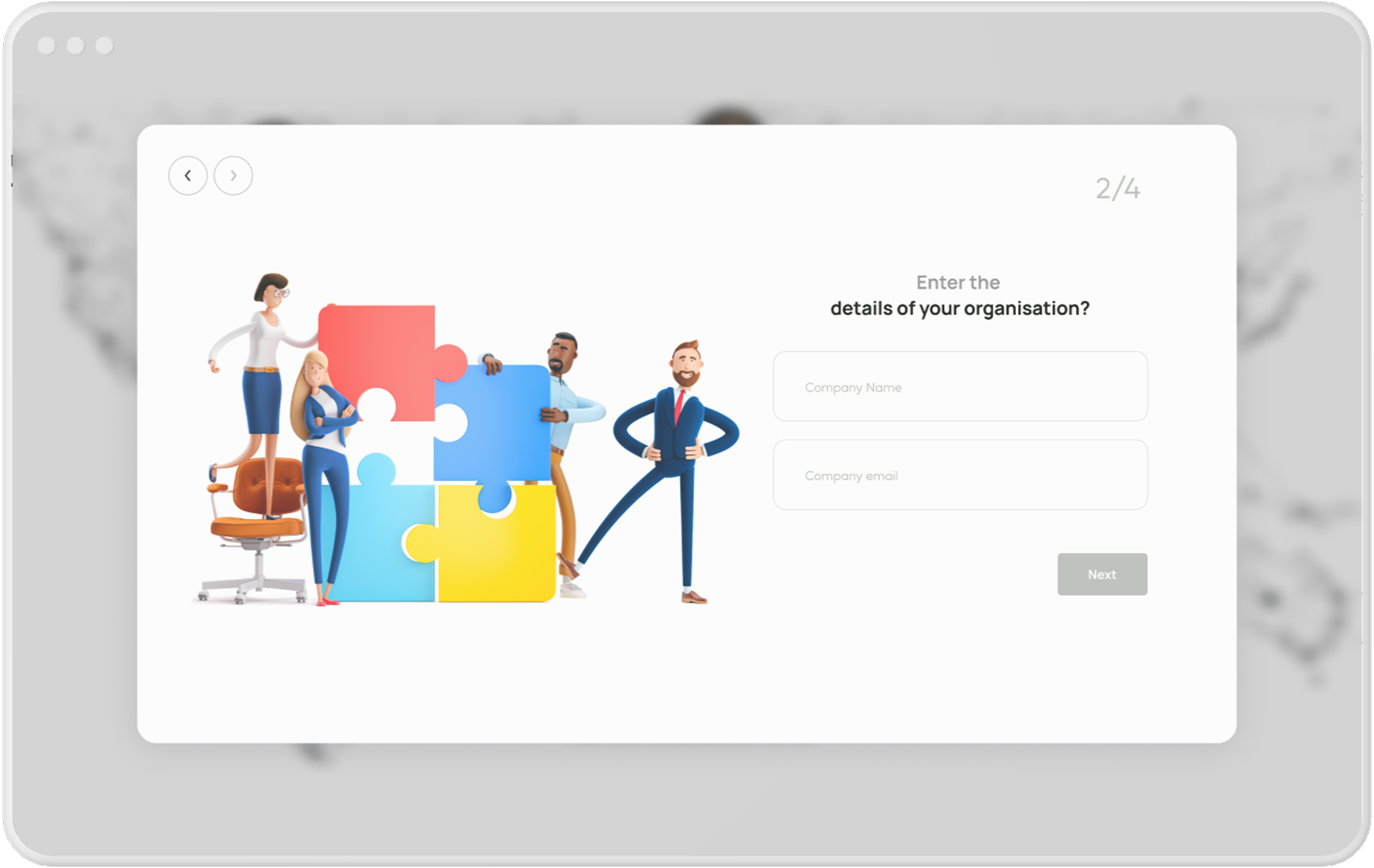
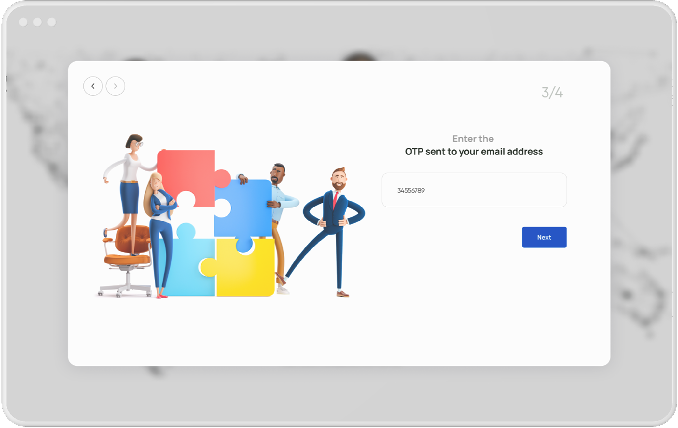
Onboarding
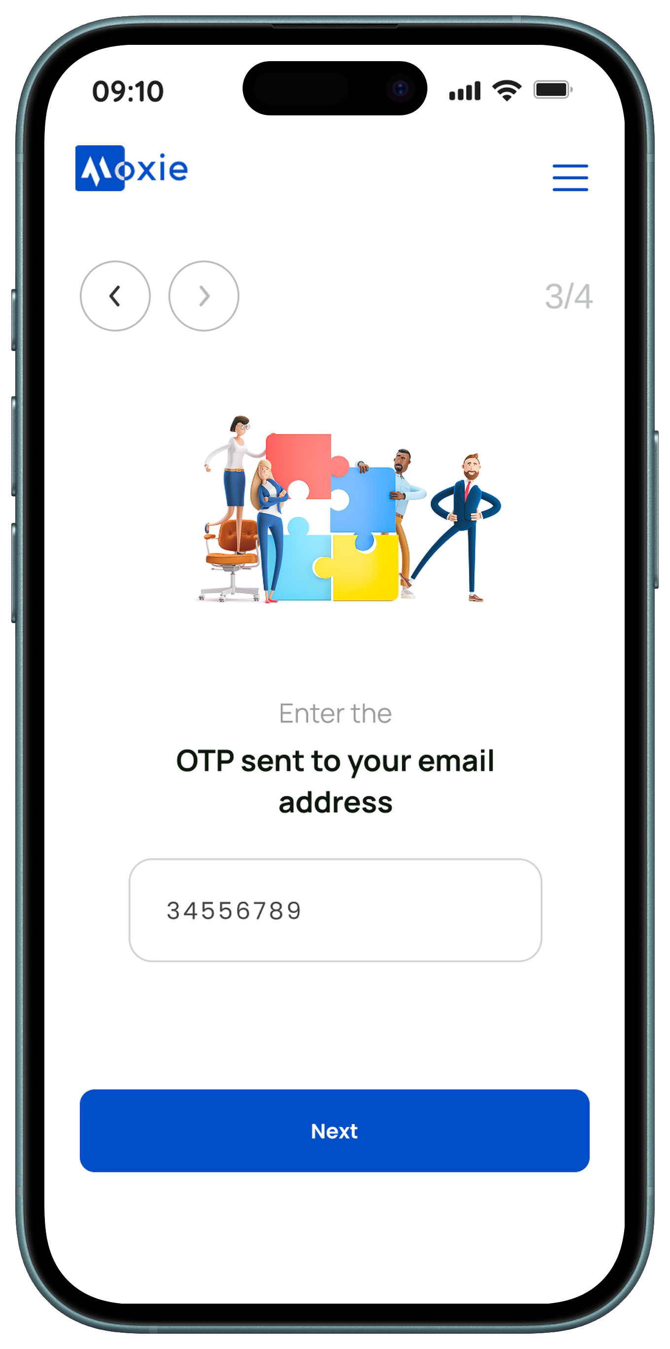
Account Creation Flow
The account creation process guides users through four simple steps, starting with identifying themselves as an individual or organization. Organizations are prompted to provide their name and email, verify their account via a one-time password (OTP), and then share additional details about their company. This structured flow ensures a smooth and secure onboarding experience.


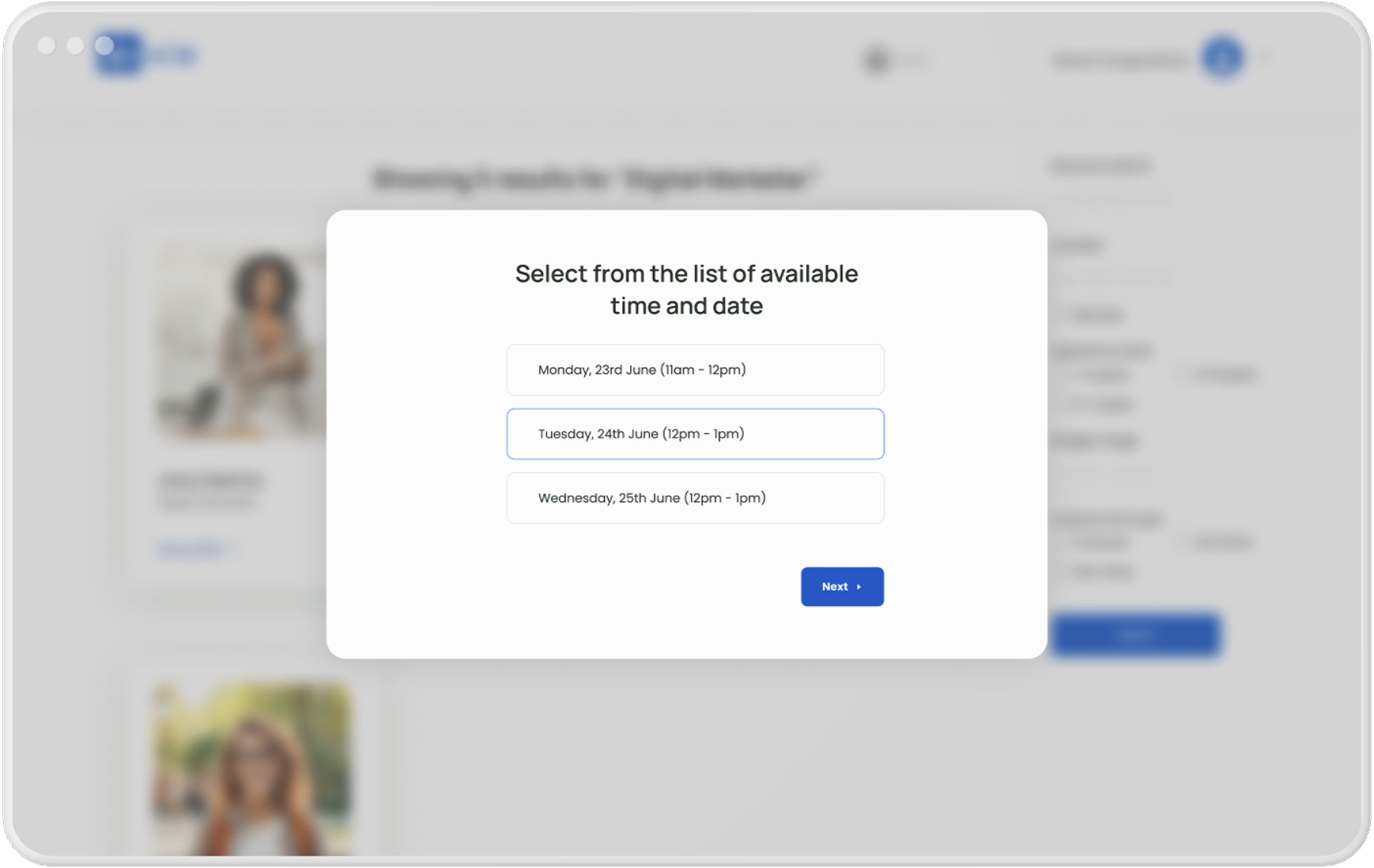
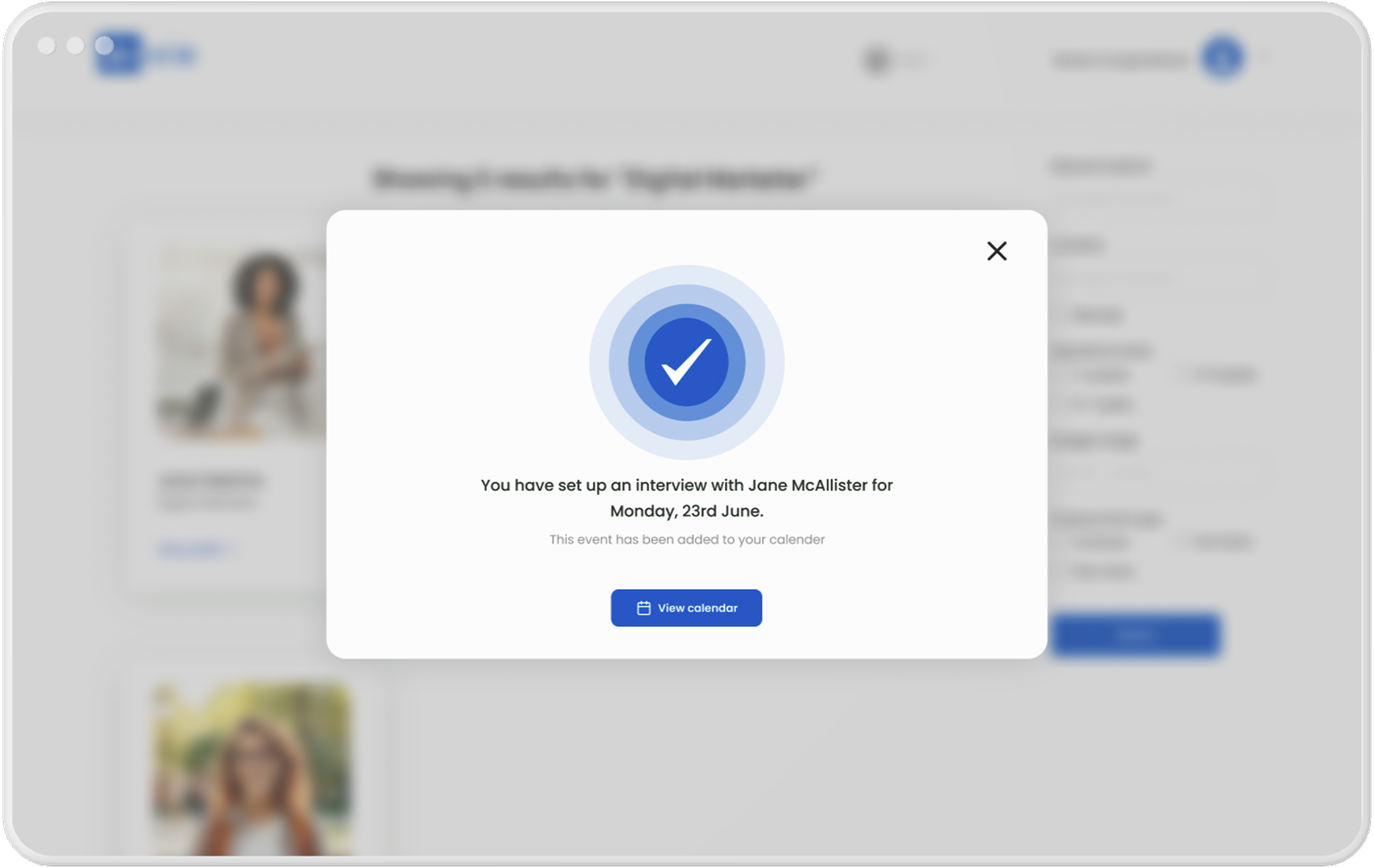
Hiring & Interview flow
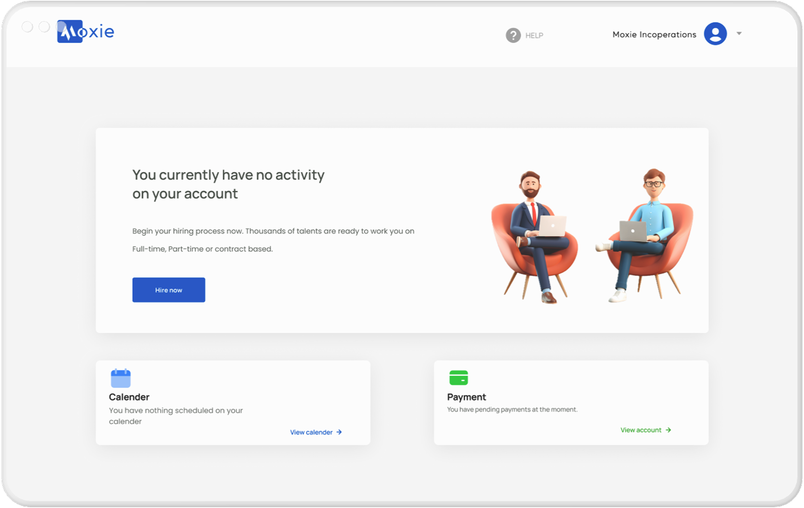
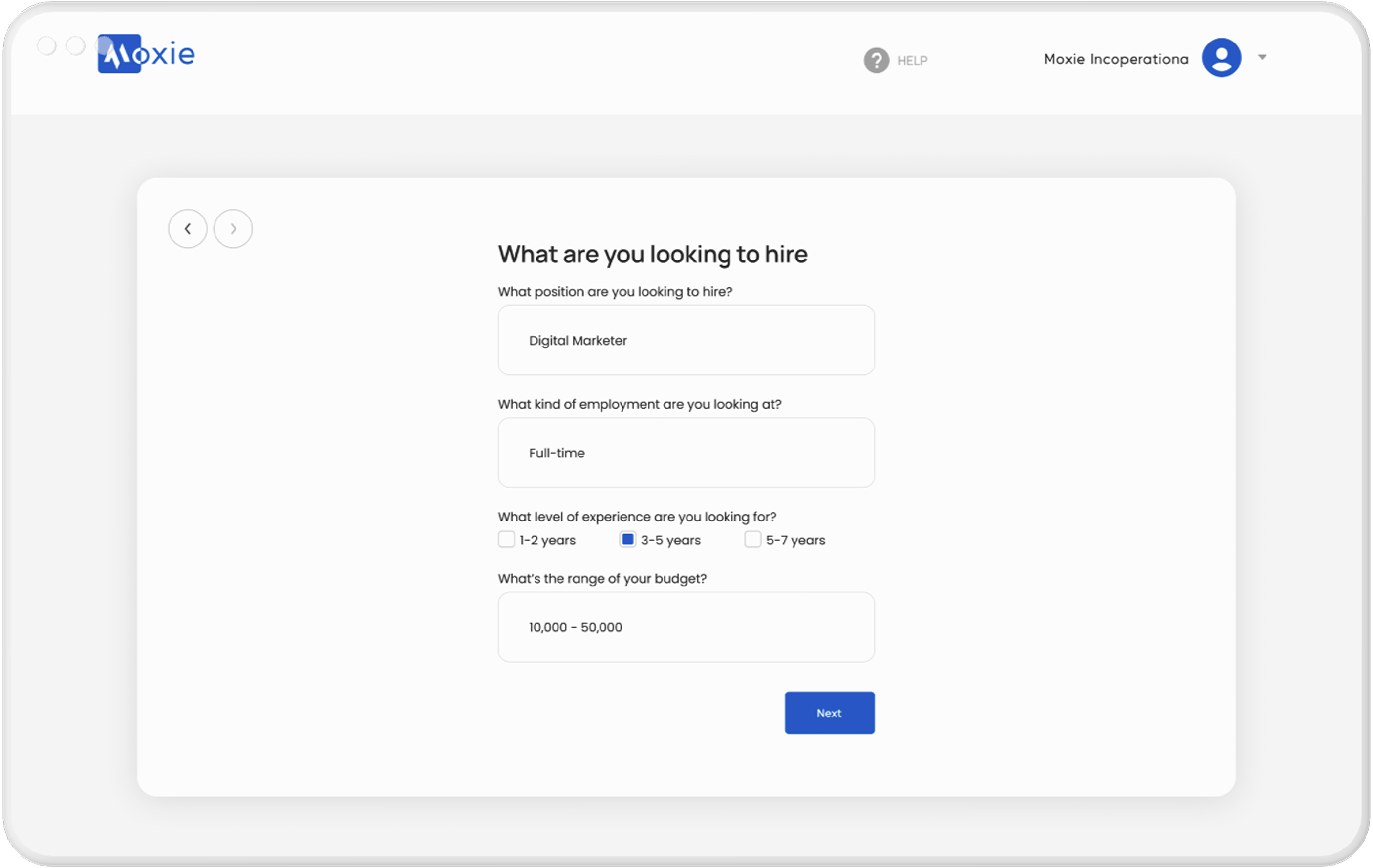
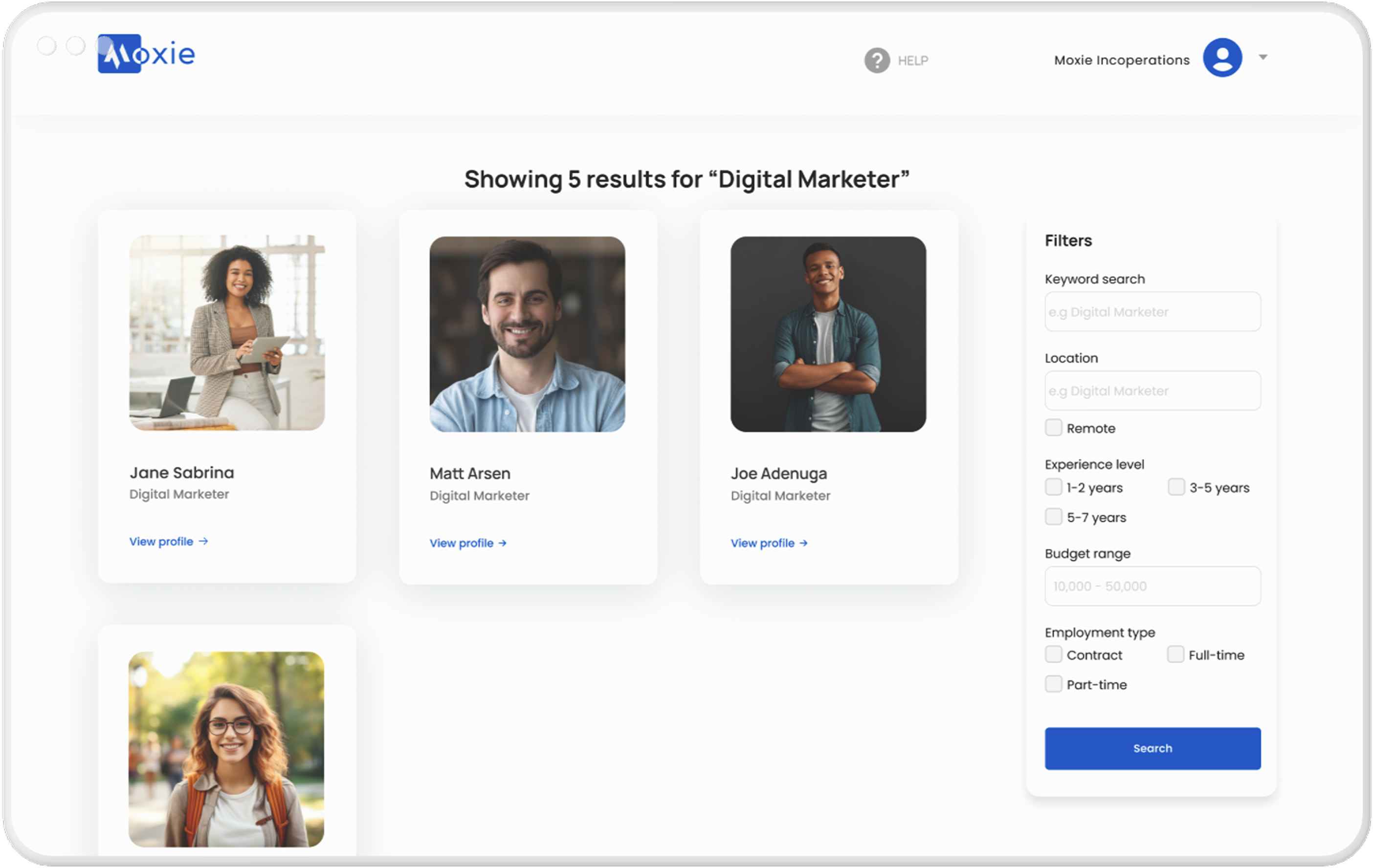
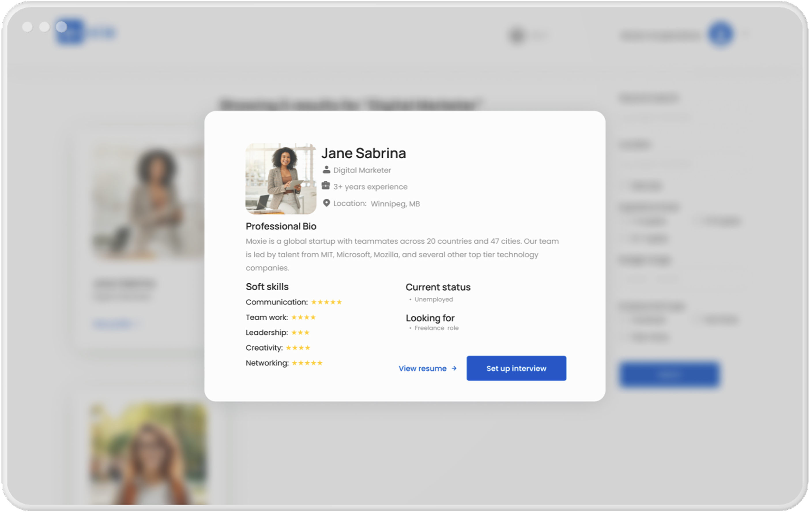
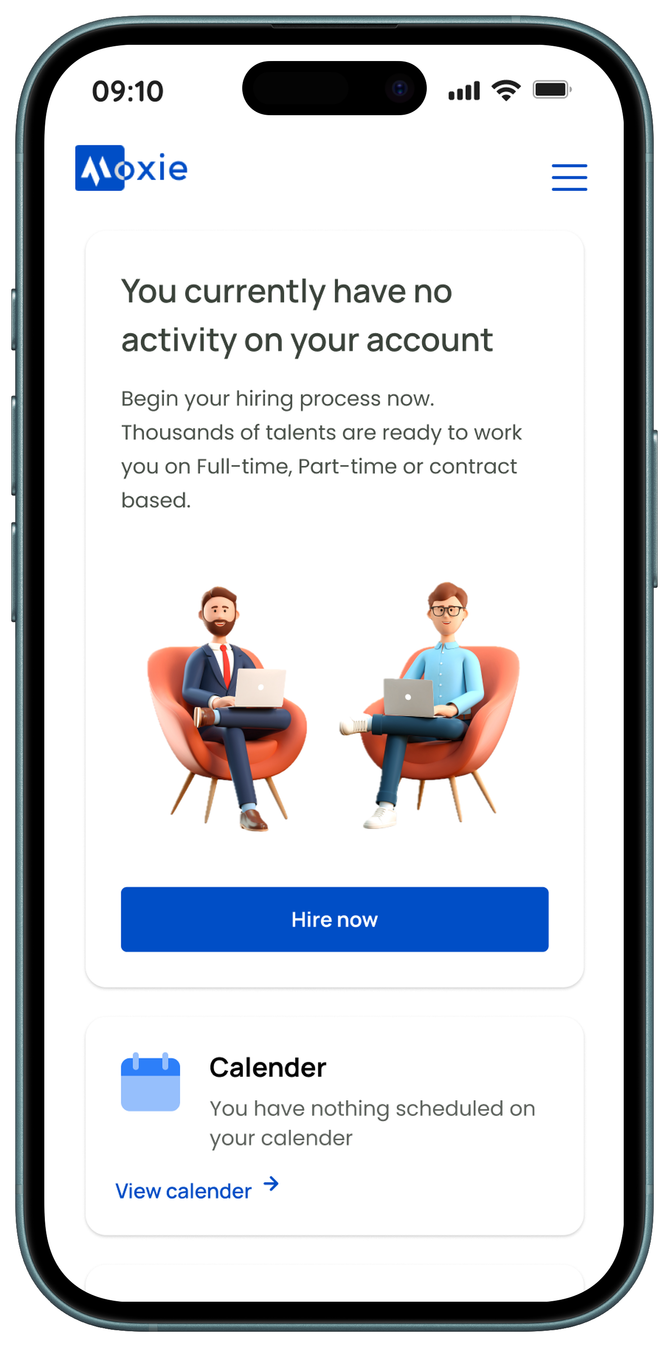
These screens guide recruiters through the hiring process, from managing their dashboard to confirming interviews. Users can start hiring, view upcoming events, and track payments from the hiring dashboard. The search dashboard lets them find candidates using filters, view detailed profiles, and select interview dates based on each candidate’s availability. Finally, the interview confirmation screen provides a summary and quick access to the calendar for easy scheduling.
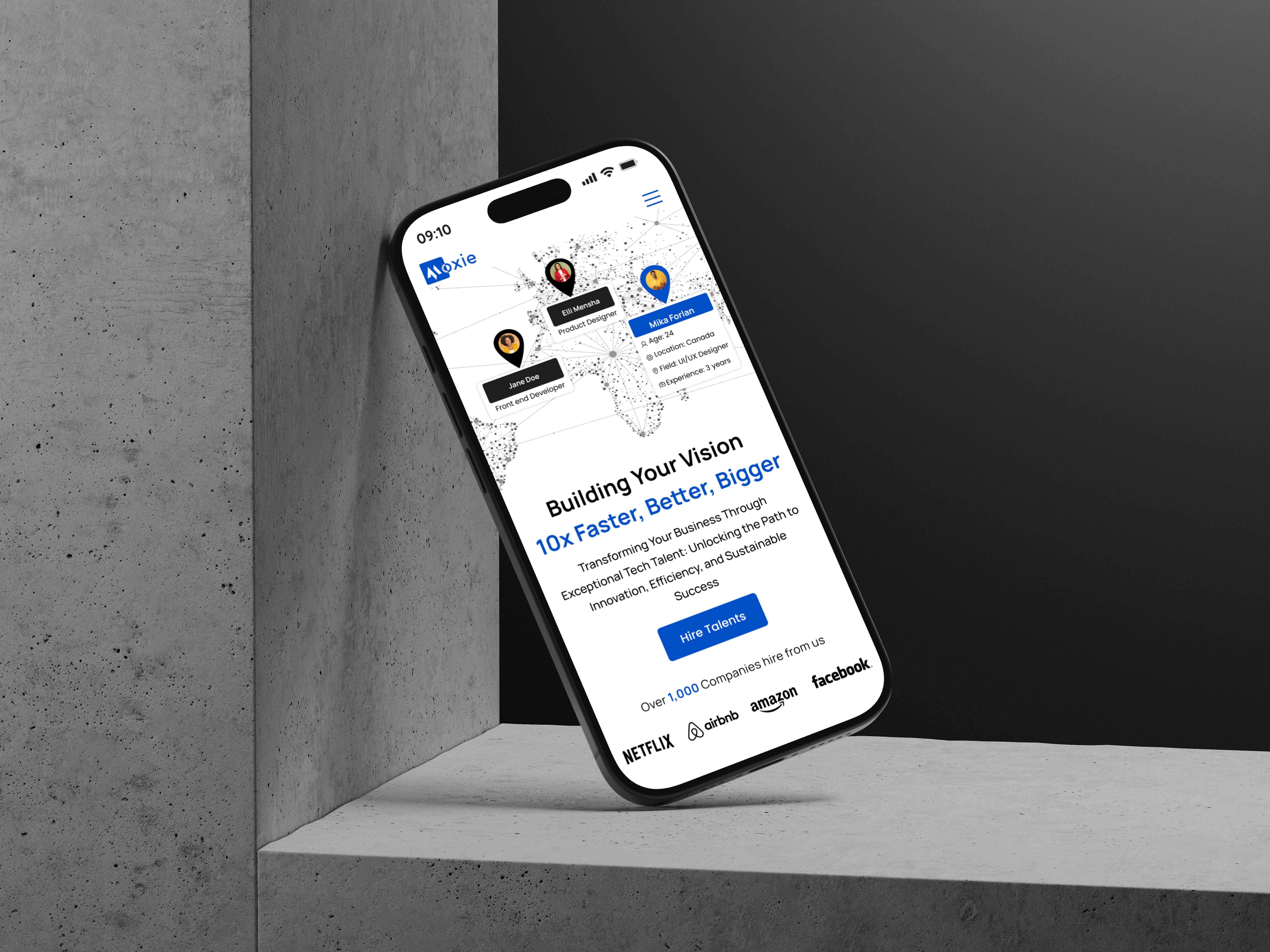
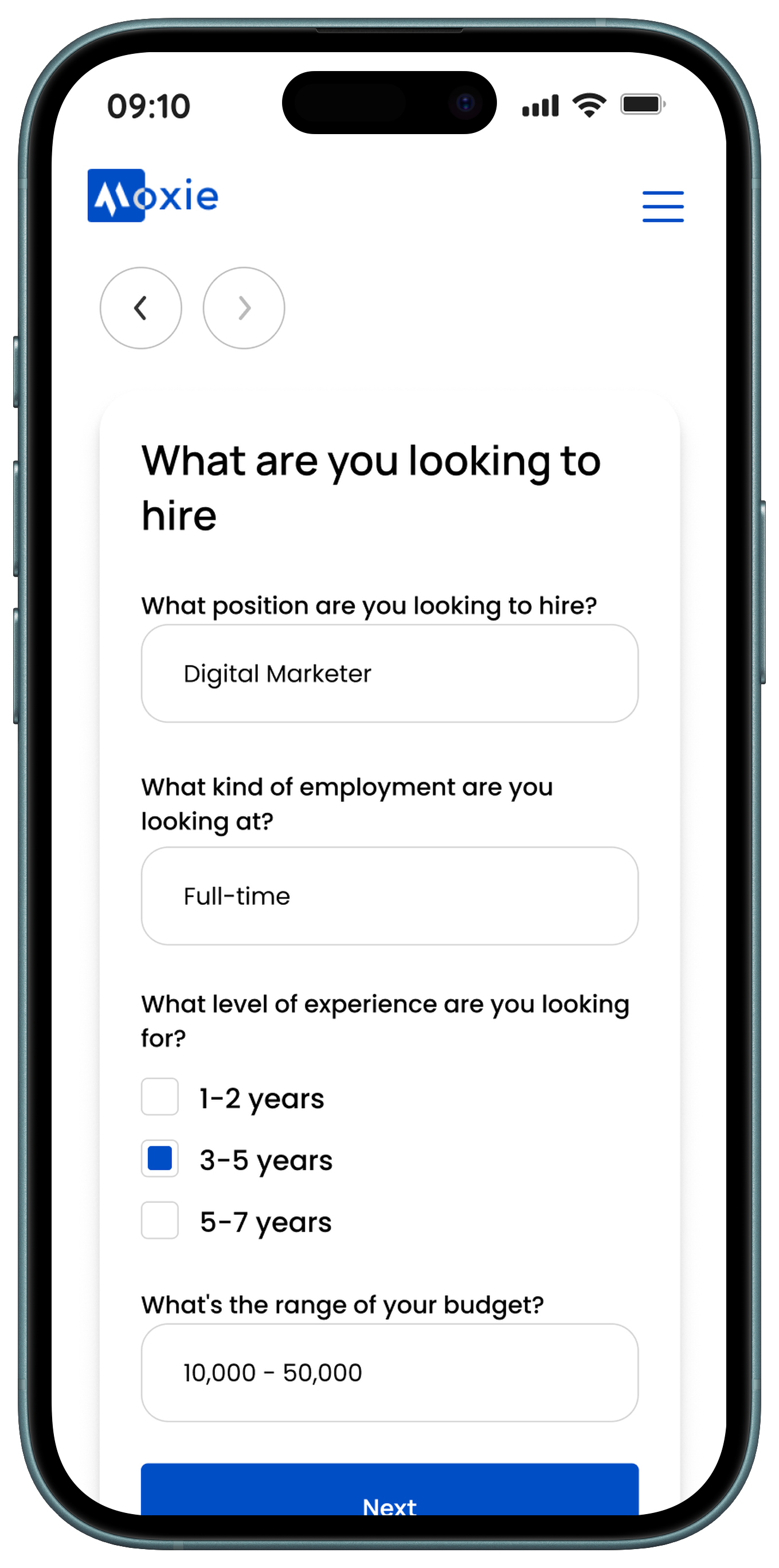
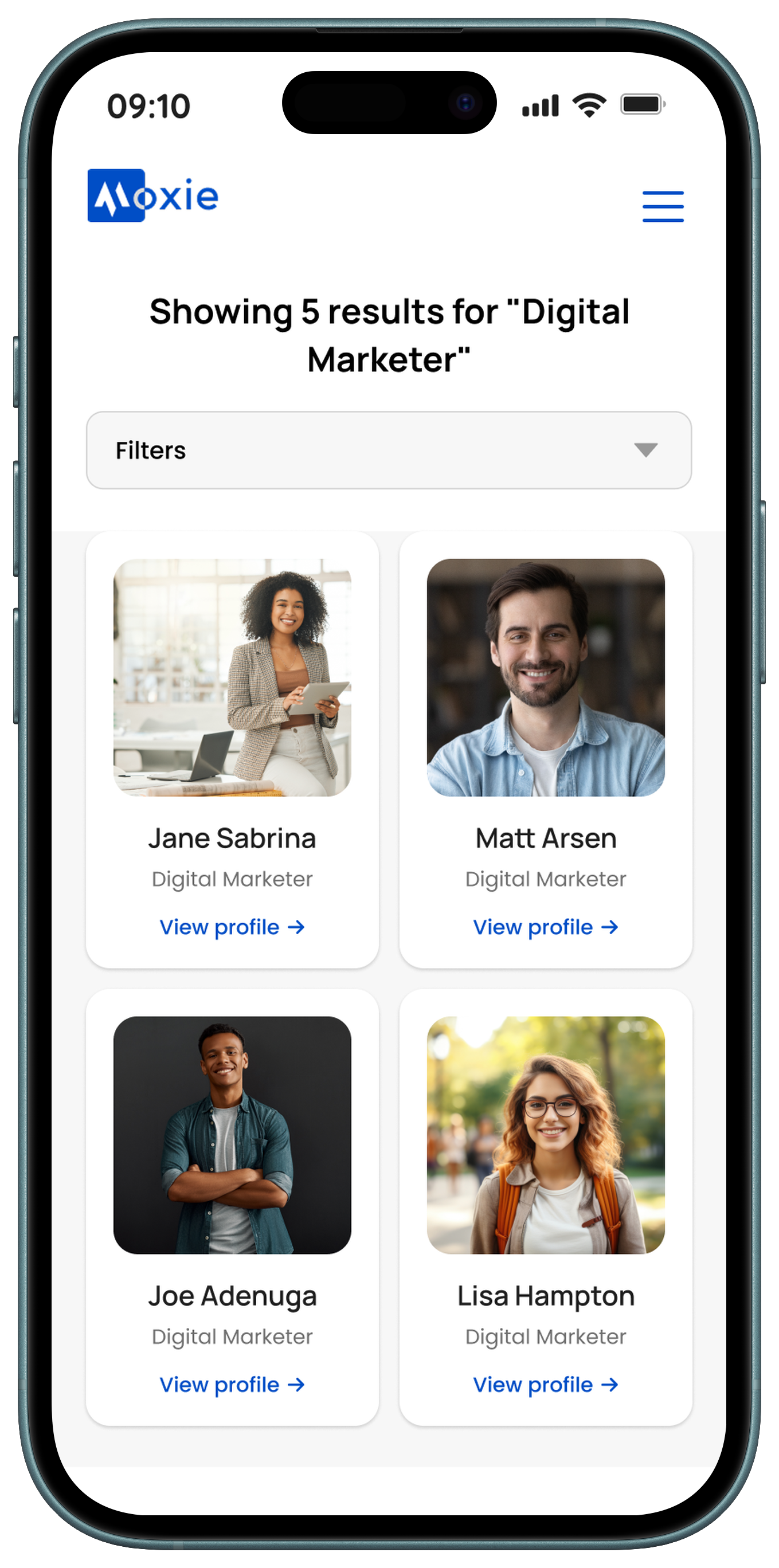
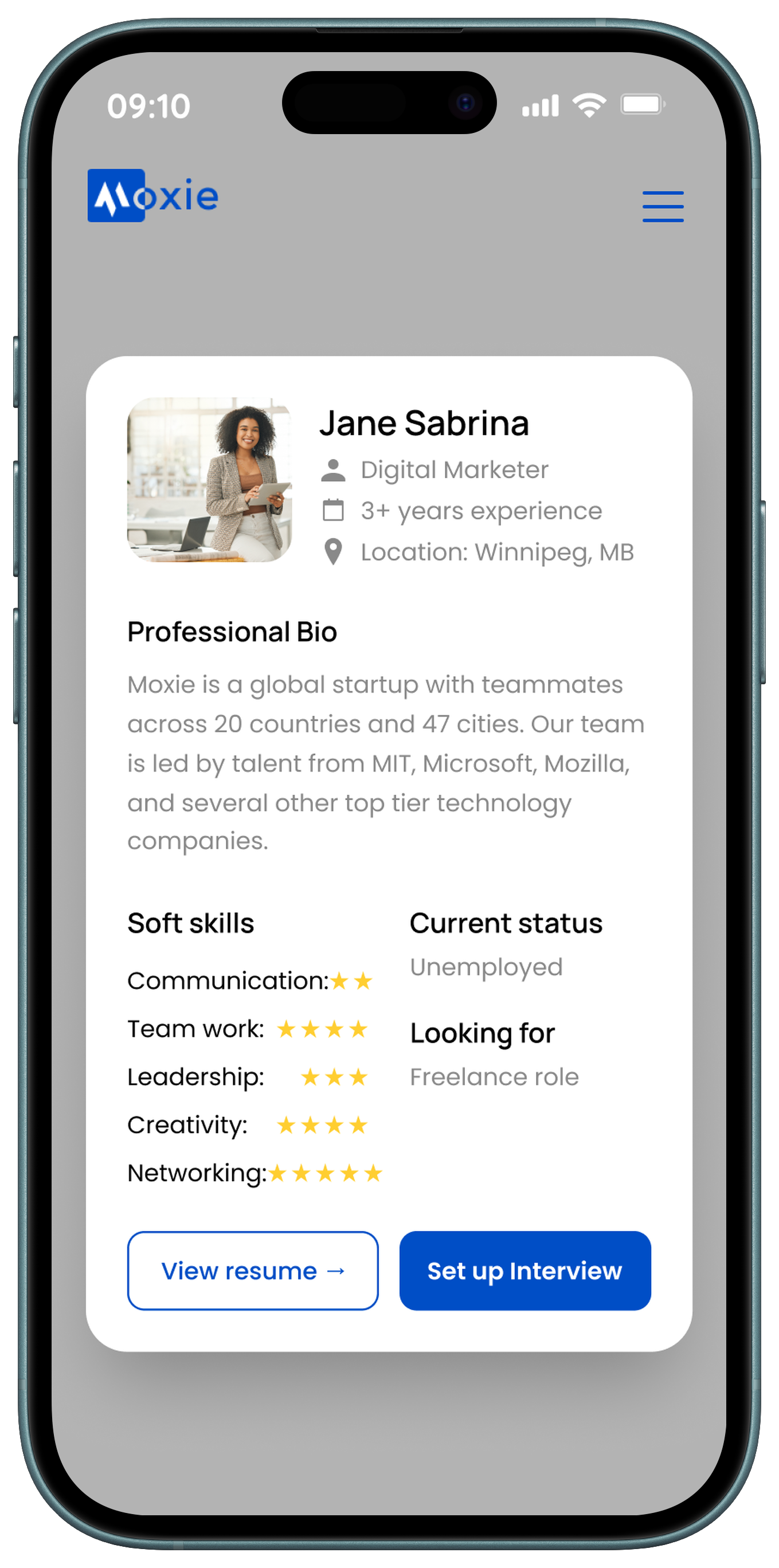
📱 Supporting Mobile Experience
While the Moxie platform is optimized for desktop-based hiring workflows, a streamlined mobile experience was designed to support lighter, on-the-go interactions. Mobile screens focus on quick actions such as checking messages, viewing notifications, and reviewing candidate updates, ensuring users stay connected without overwhelming smaller screens with complex hiring tools.
✅ Final Outcome
The interface was designed to:
- Delivered a complete visual system and high-fidelity UI for a hiring platform
- Established a professional, trustworthy brand presence
- Designed responsive interfaces for both desktop and mobile
- Created scalable components to support future product growth
🧠 Key Takeaway
This project emphasized how strong visual systems can bring clarity to complex platforms. By focusing on typography, spacing, color balance, and component consistency, I helped shape a hiring platform that feels professional, approachable, and easy to navigate.