| Method | Purpose |
|---|---|
| User Interviews | Explore learning behavior, frustrations, and workflow gaps |
| Comparative analysis | Identify best practices in learning platforms |
| Prototype Testing | Validate LMS design against user needs |
| Analytics Review | Track engagement and completion rates (after pilot/prototype) |
Scroll right to see more details →
Research Process Flow
Interviews
UX Testing
Analytics
Recommendations
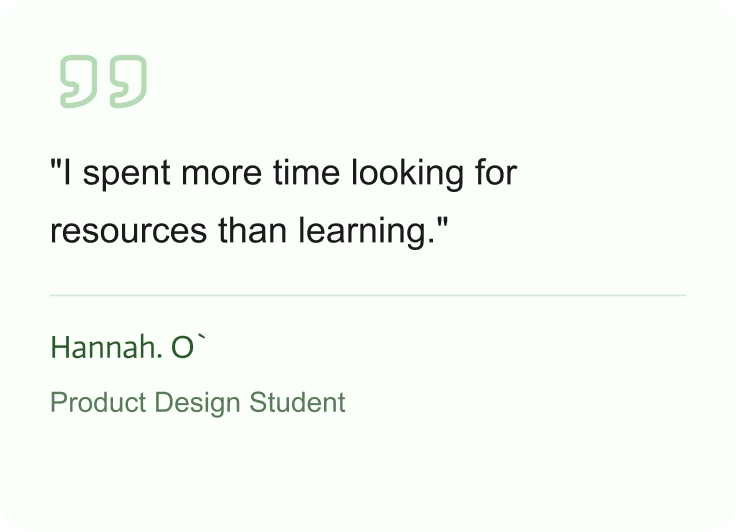
Key Findings
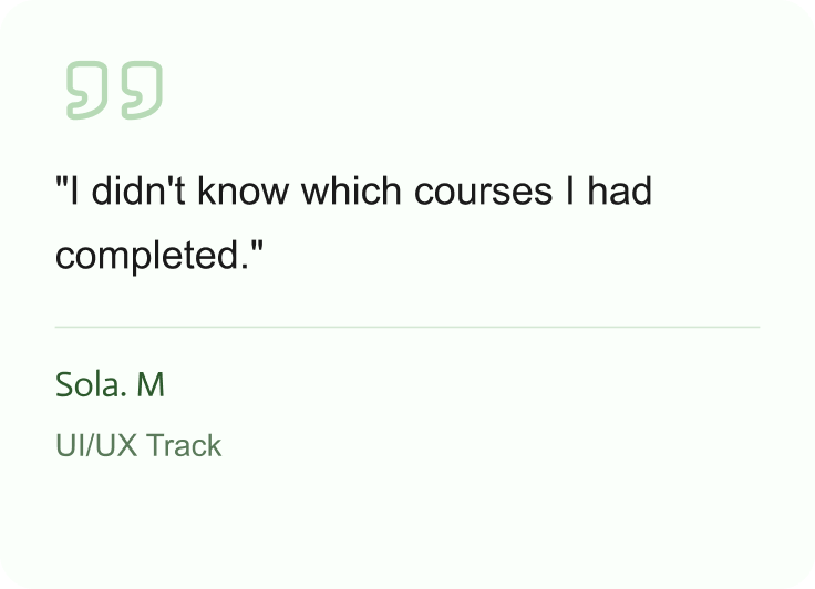
Scattered learning resources
Interns spent 30+ minutes finding materials
Outcome: Centralized dashboard reduces search timeNo progress tracking
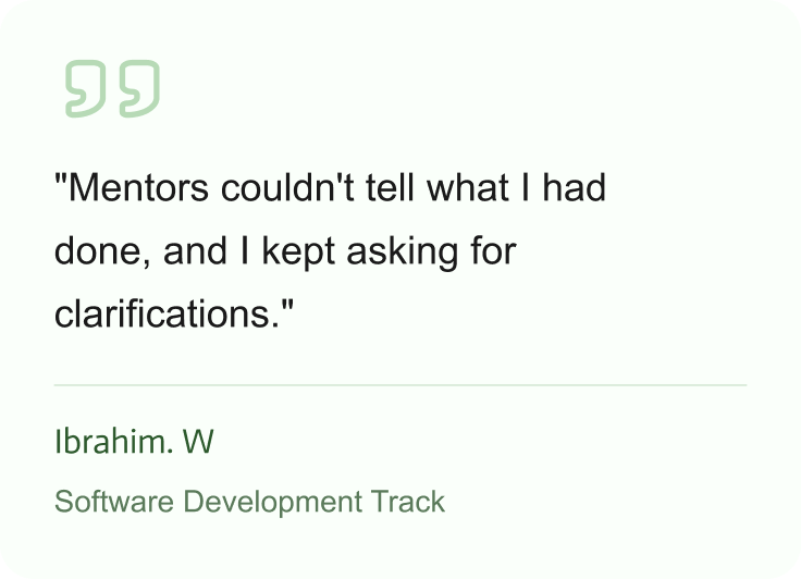
Interns and mentors lacked visibility
Progress bars and tracking implementedWorkflow confusion
Email/Teams threads made course completion unclear
Outcome: Structured modules clarified learning pathsMobile access
Materials were hard to use on mobile
Outcome: Responsive mobile-friendly design addedUser Quotes
Recommendations and Design Solutions
| Challenge | Solution |
|---|---|
| Scattered resources | Centralized learning dashboard |
| No progress visibility | Progress bars and completion tracking |
| Unstructured course delivery | Structured modules, clear onboarding flow |
| Mobile friction | Mobile-responsive LMS |
Outcome and Impact
| Metric | Before (4.0) | After (5.0) | Change |
|---|---|---|---|
| Time to find learning materials | 30+ min | 5 min | 83% faster |
| Course completion tracking | None | Full visibility | +100% |
| Intern confidence | 2/5 | 4.5/5 | +2.5 |
| Mentor visibility | None | Full dashboard | +100% |
Performance Comparison
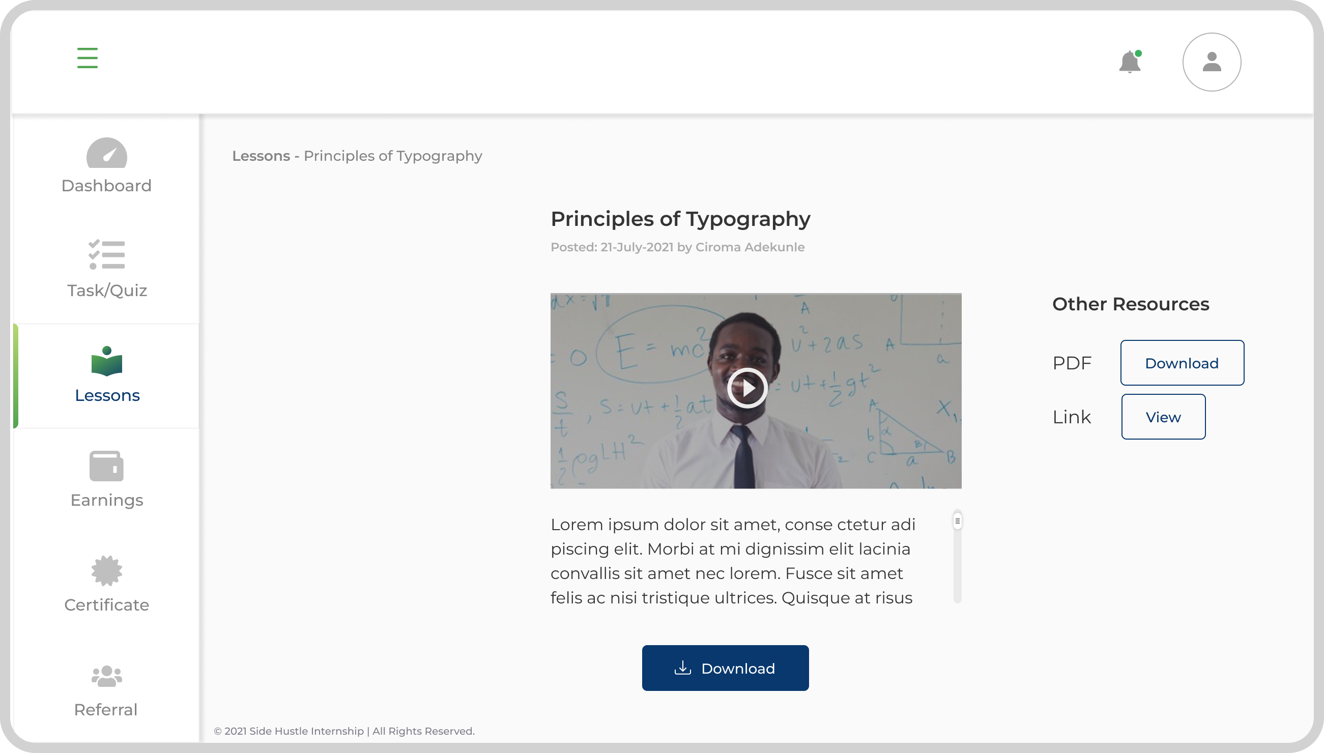
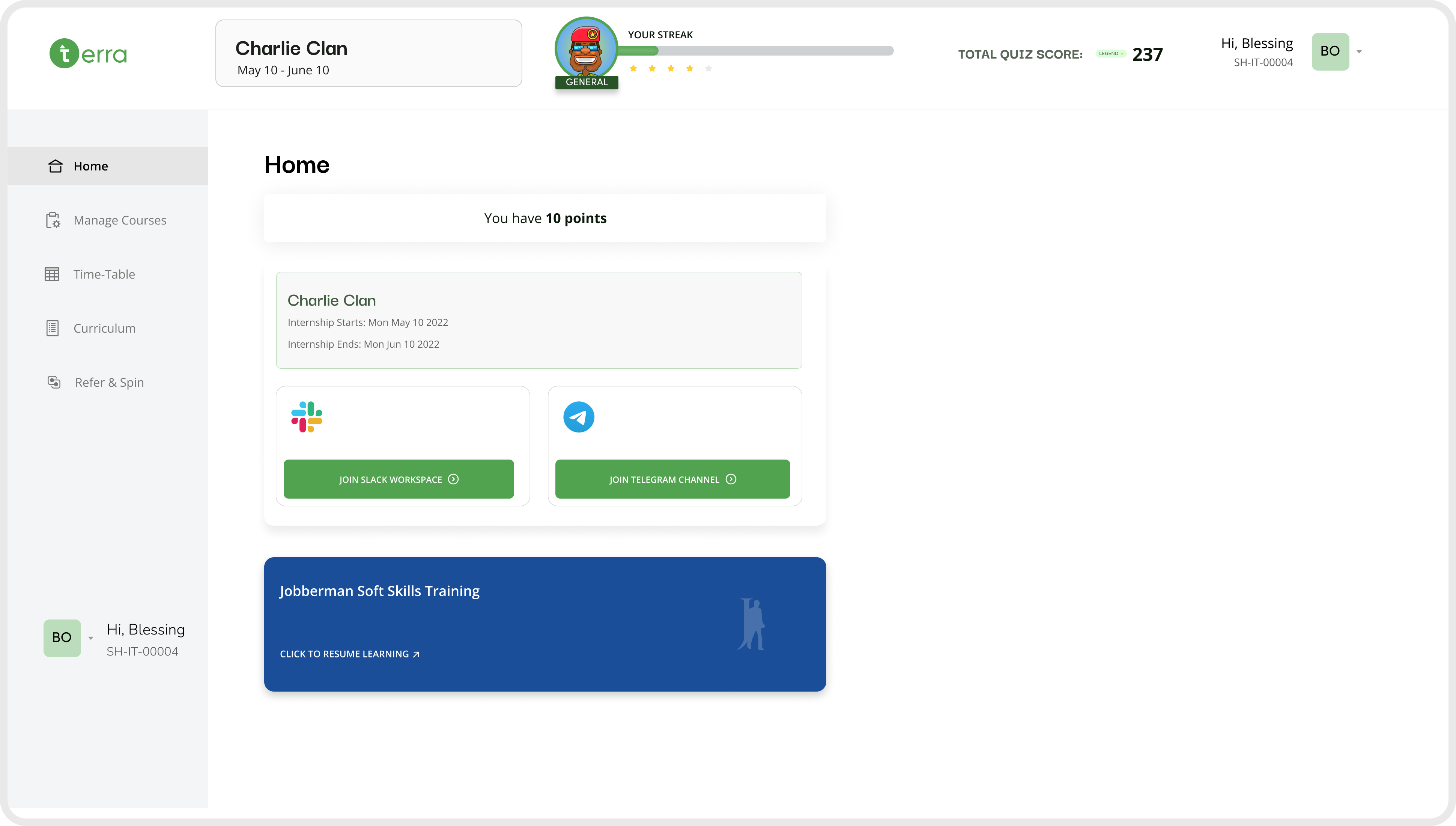
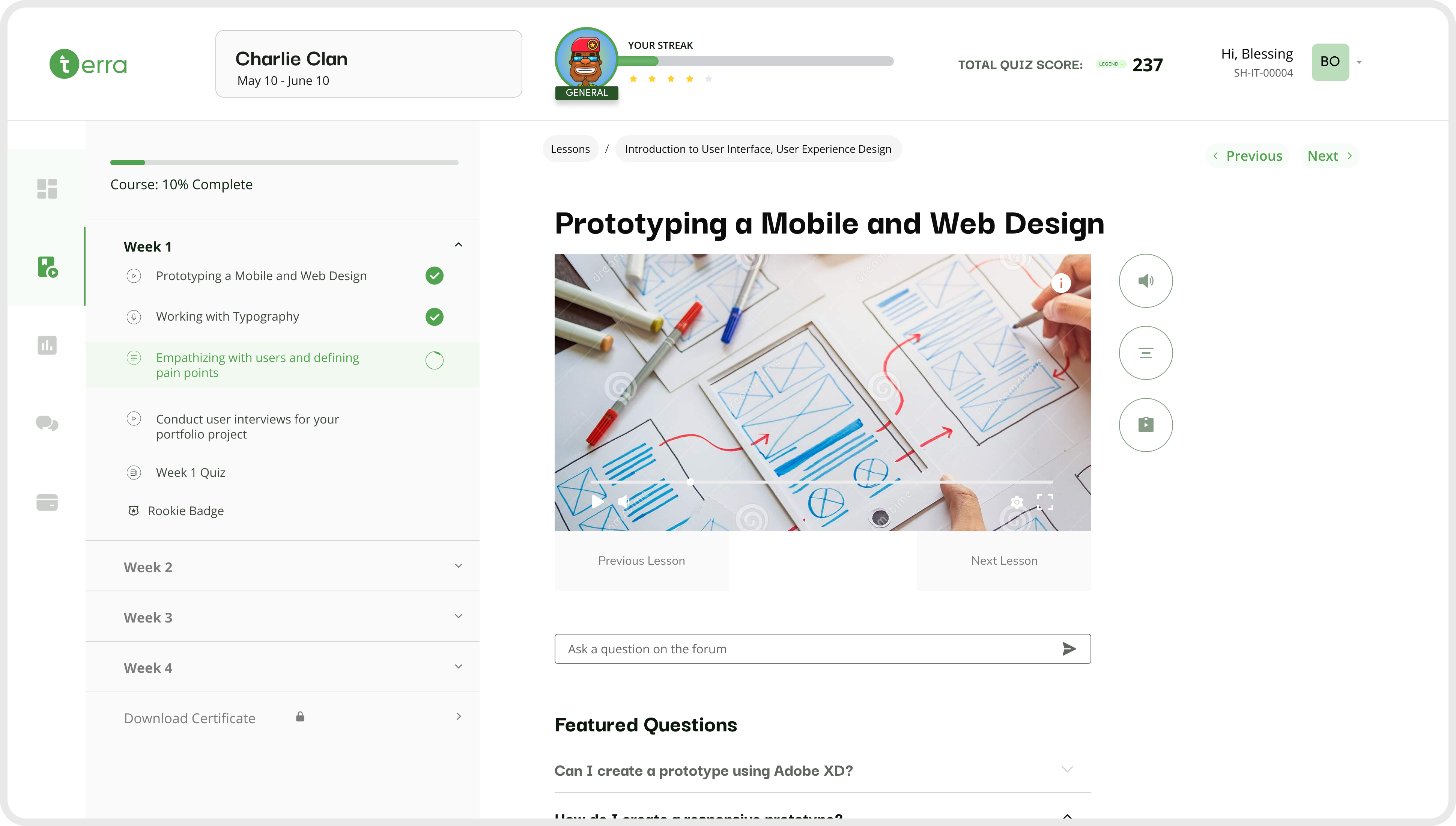
Final screens
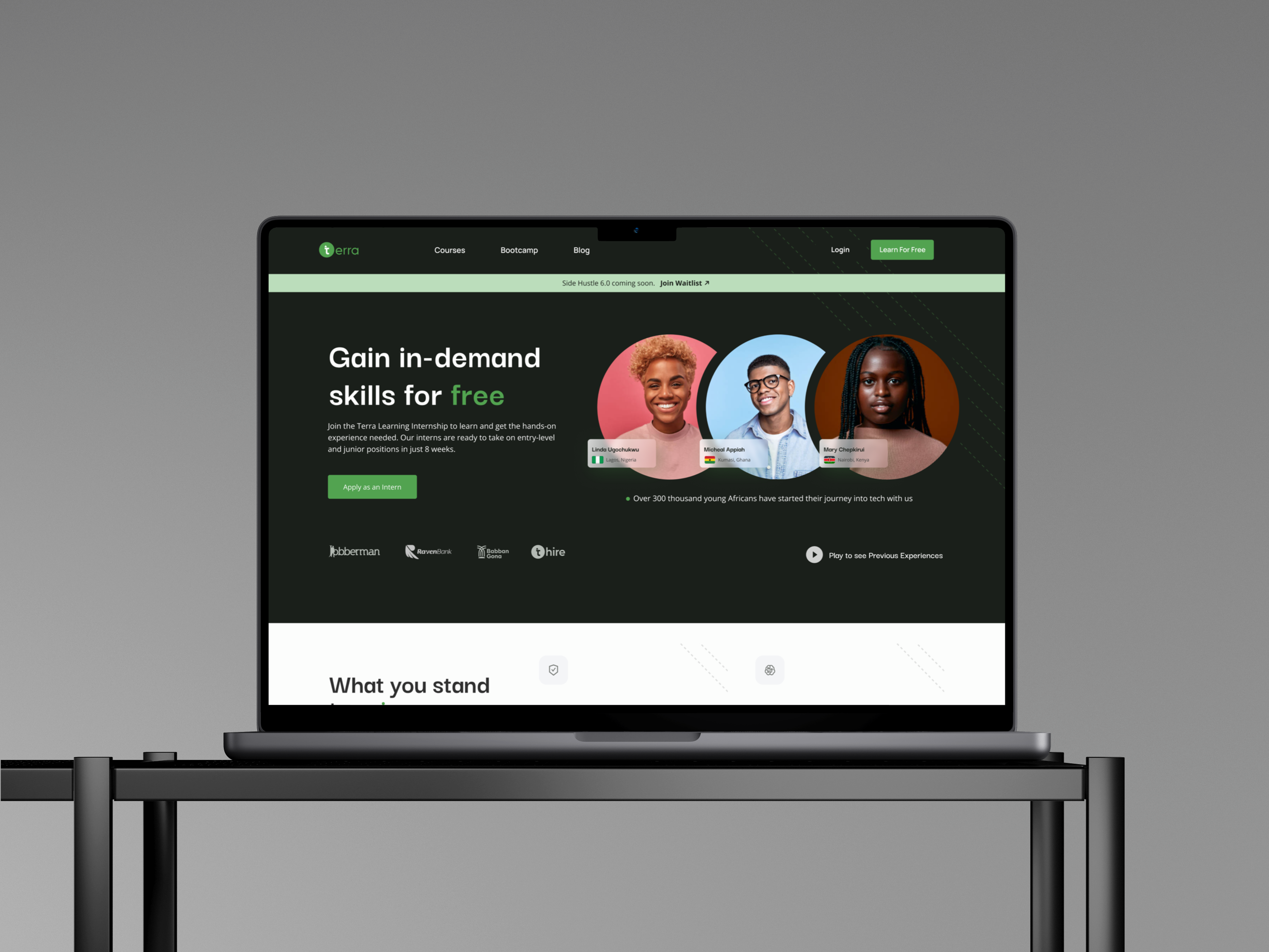
Desktop
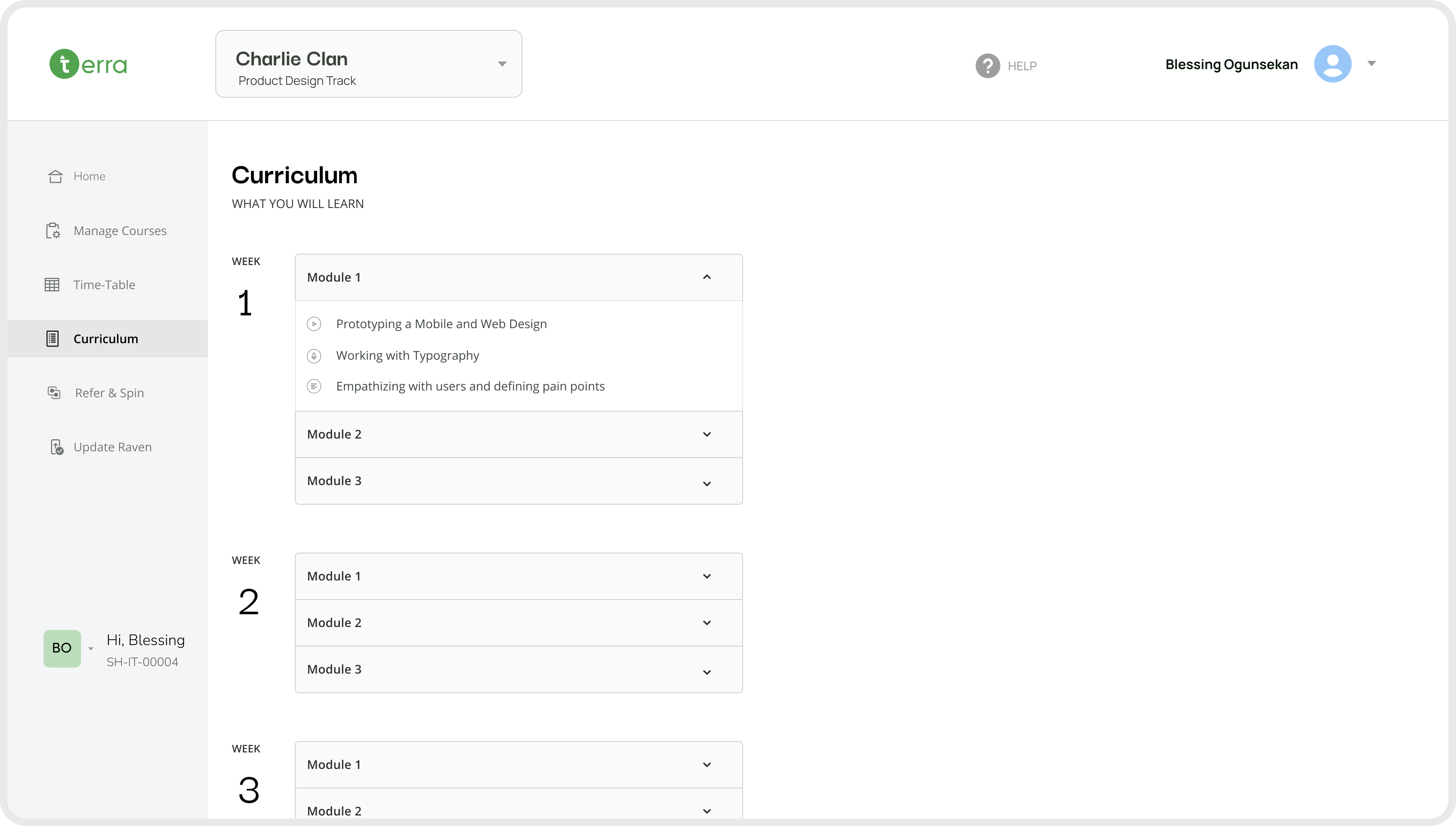
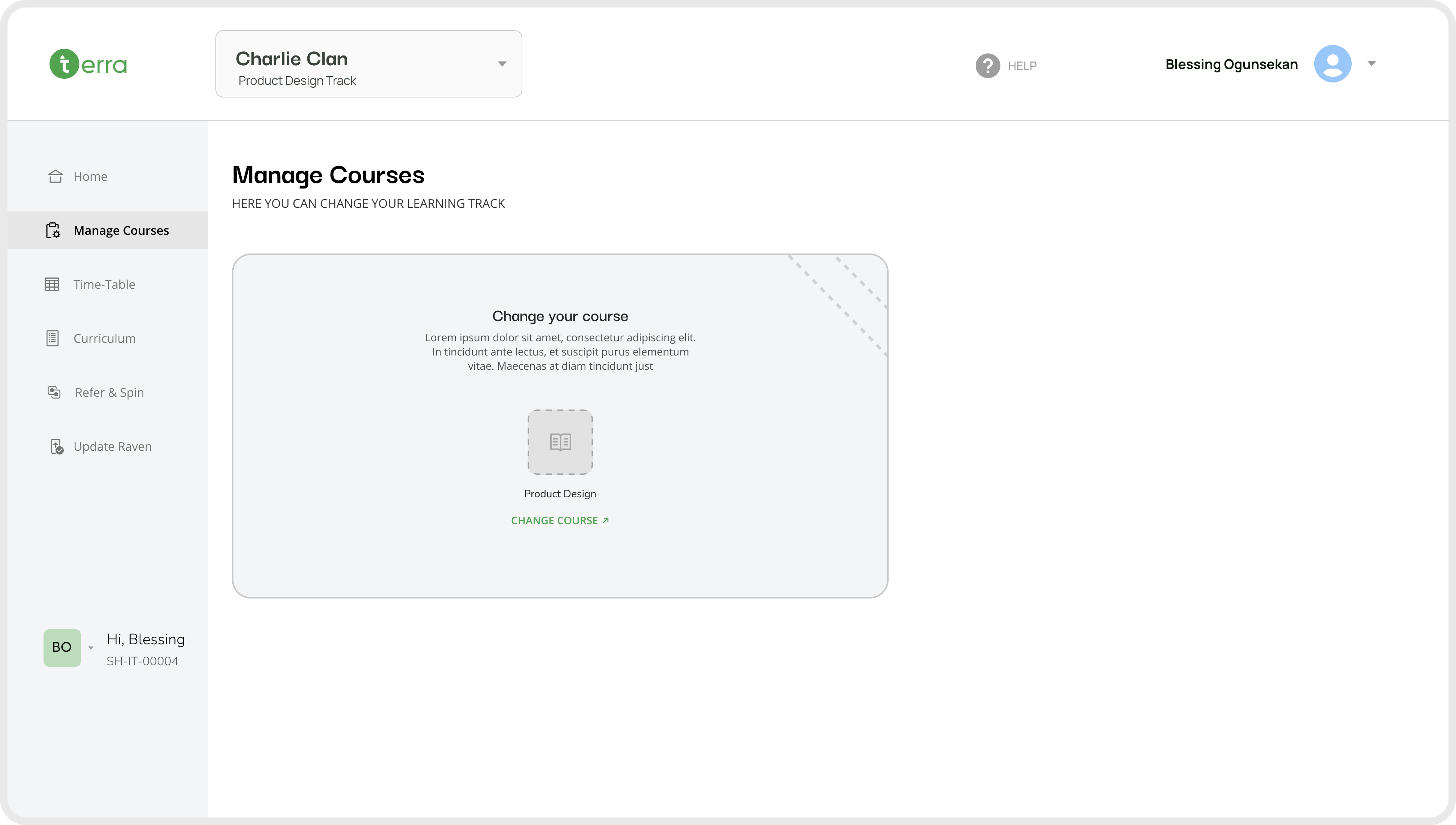
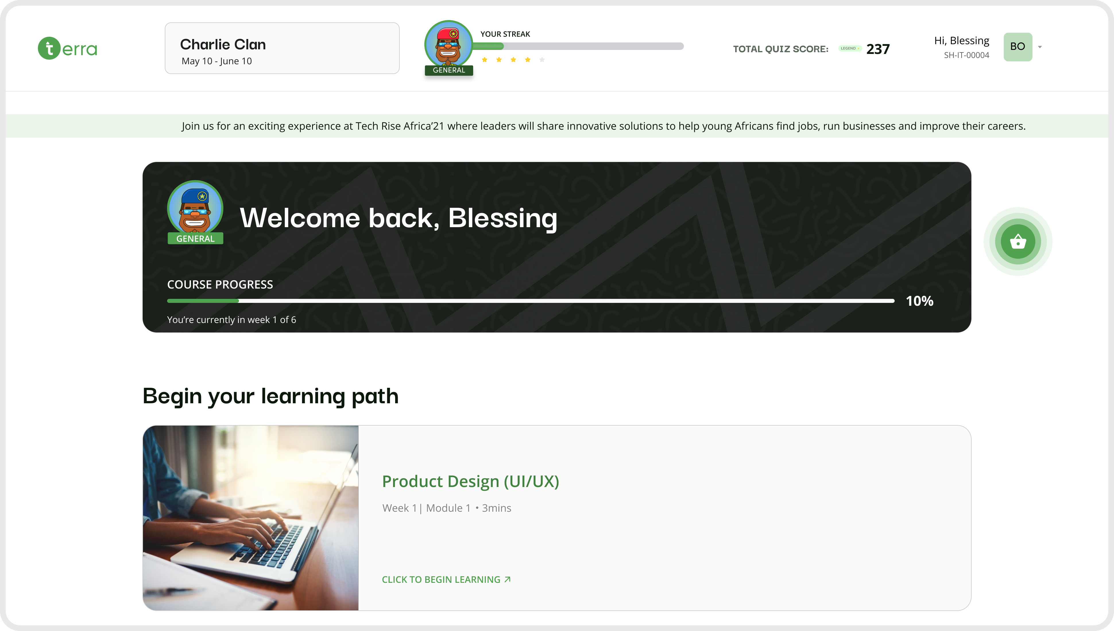
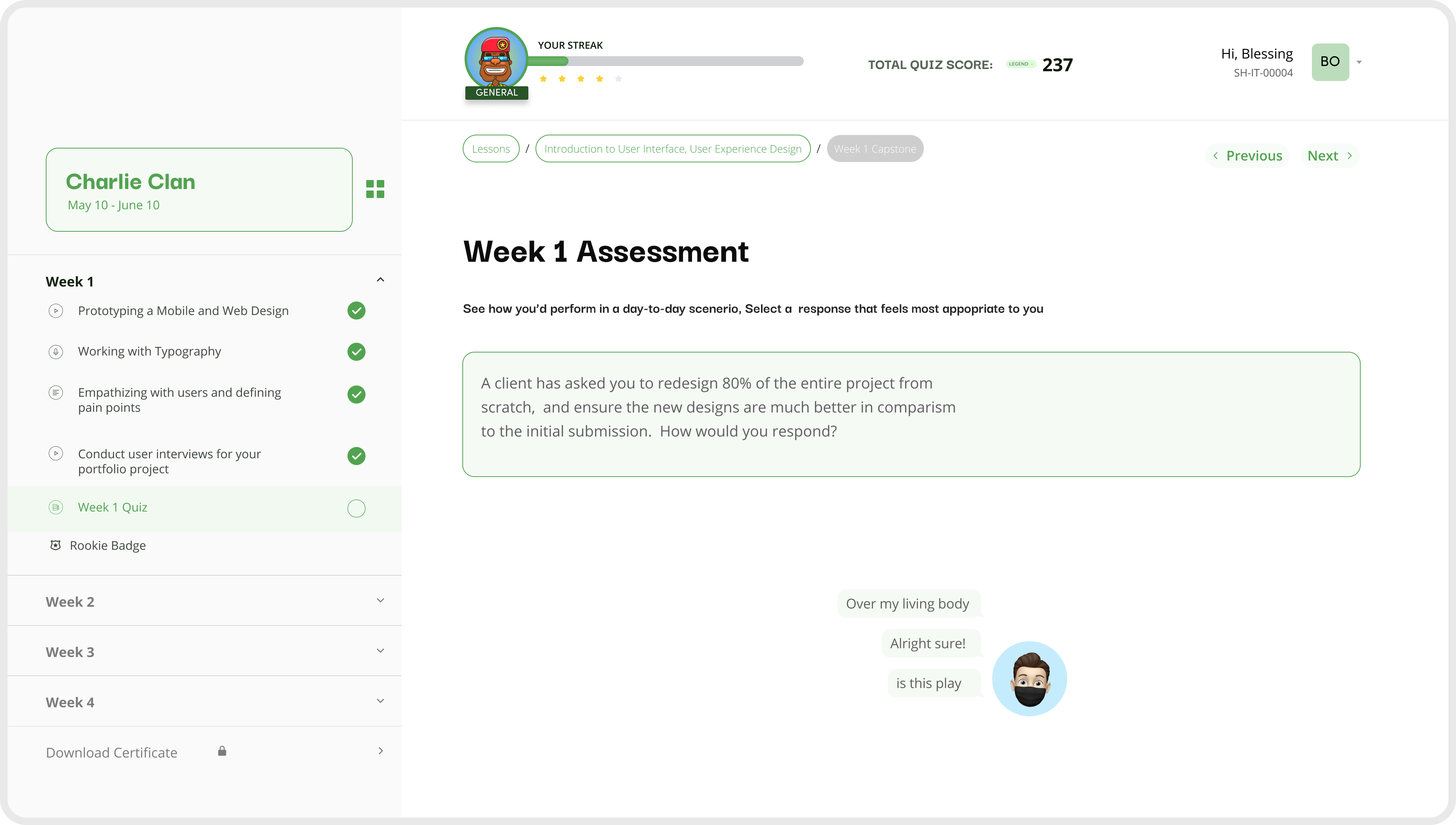
The following screens showcase the final LMS experience designed to support both interns and mentors. The platform centralizes learning, simplifies course navigation, and makes progress tracking clear and accessible. These high-fidelity designs demonstrate how research insights were translated into a structured, user-friendly learning environment.
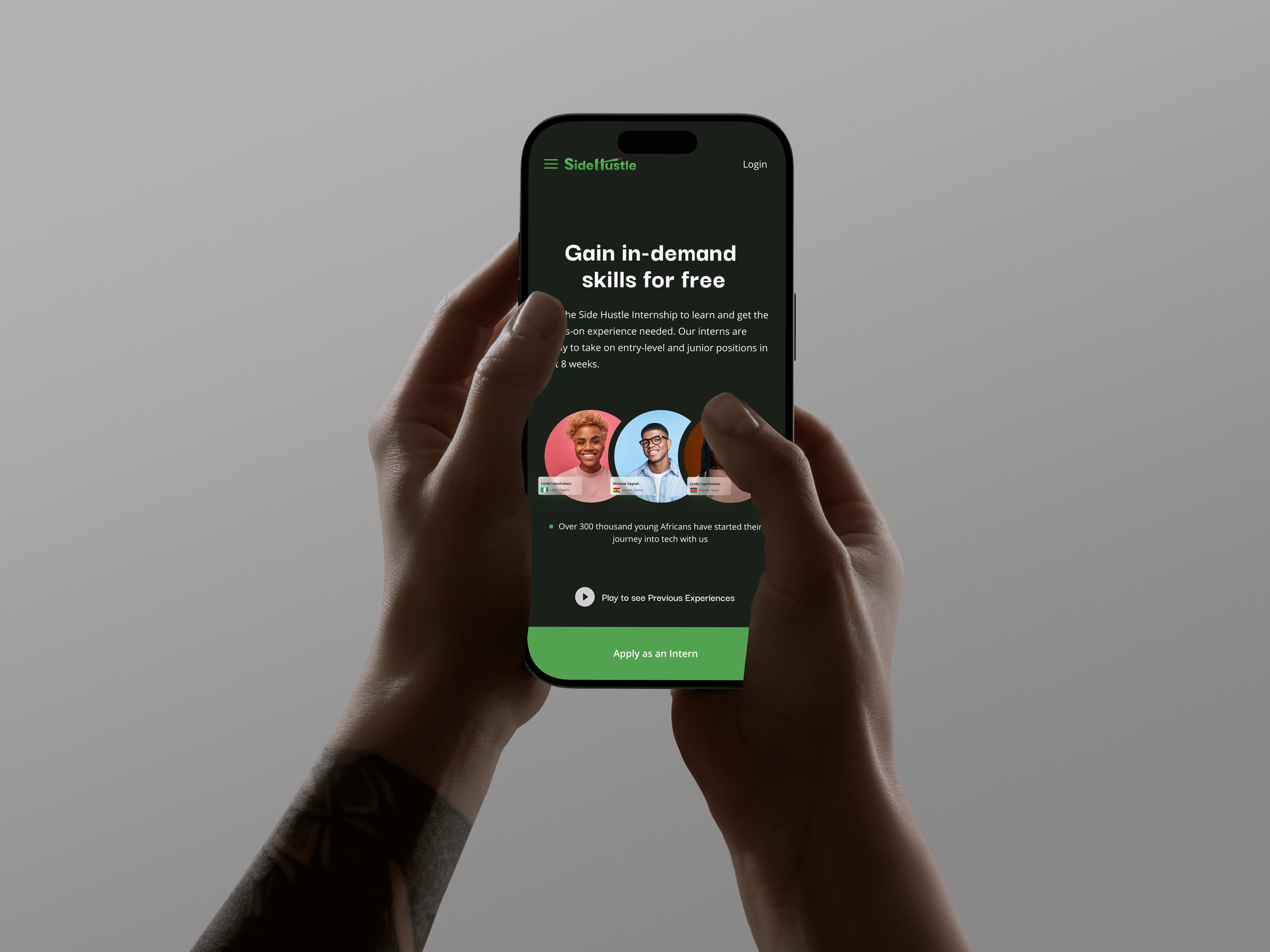
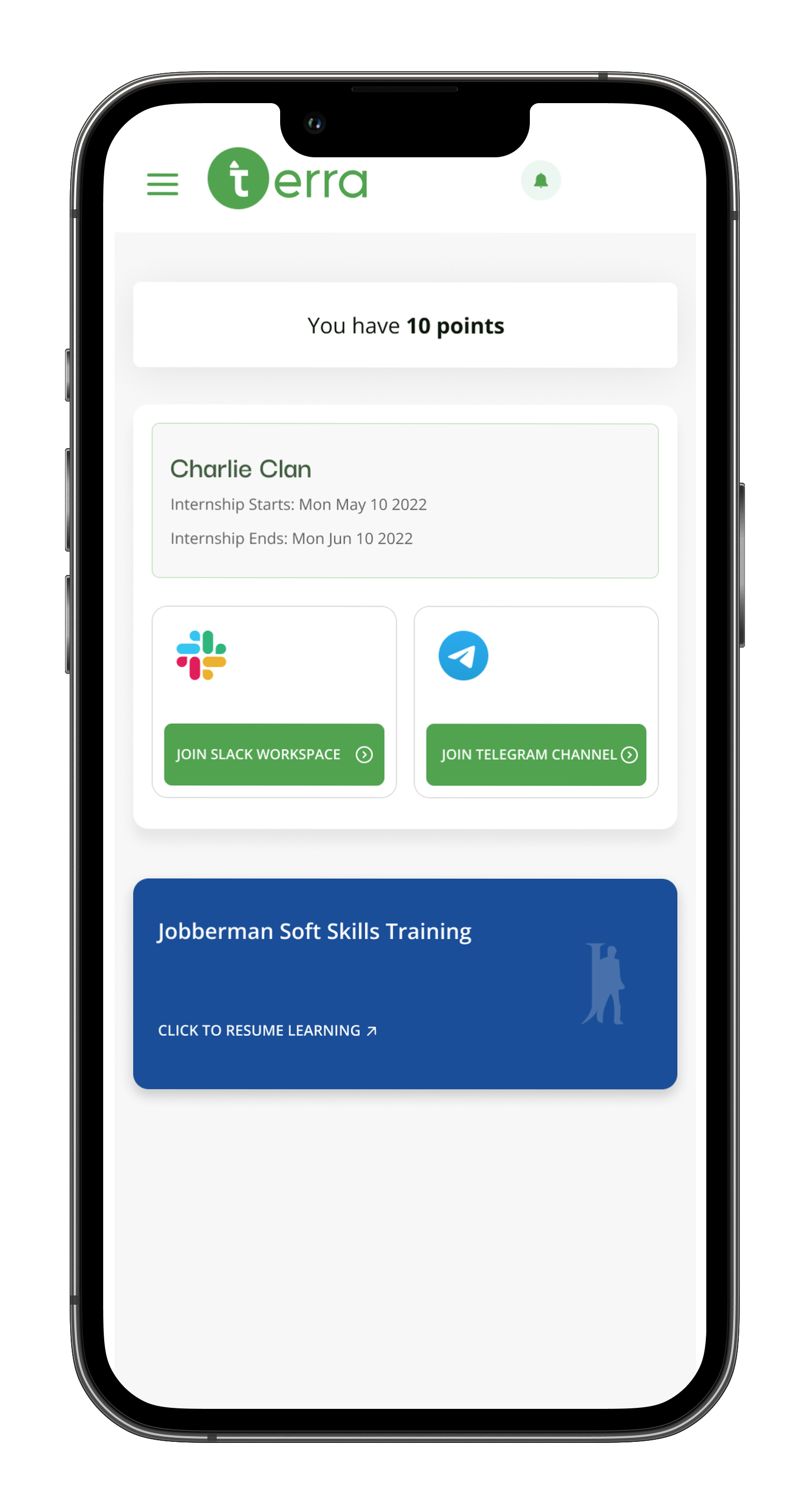
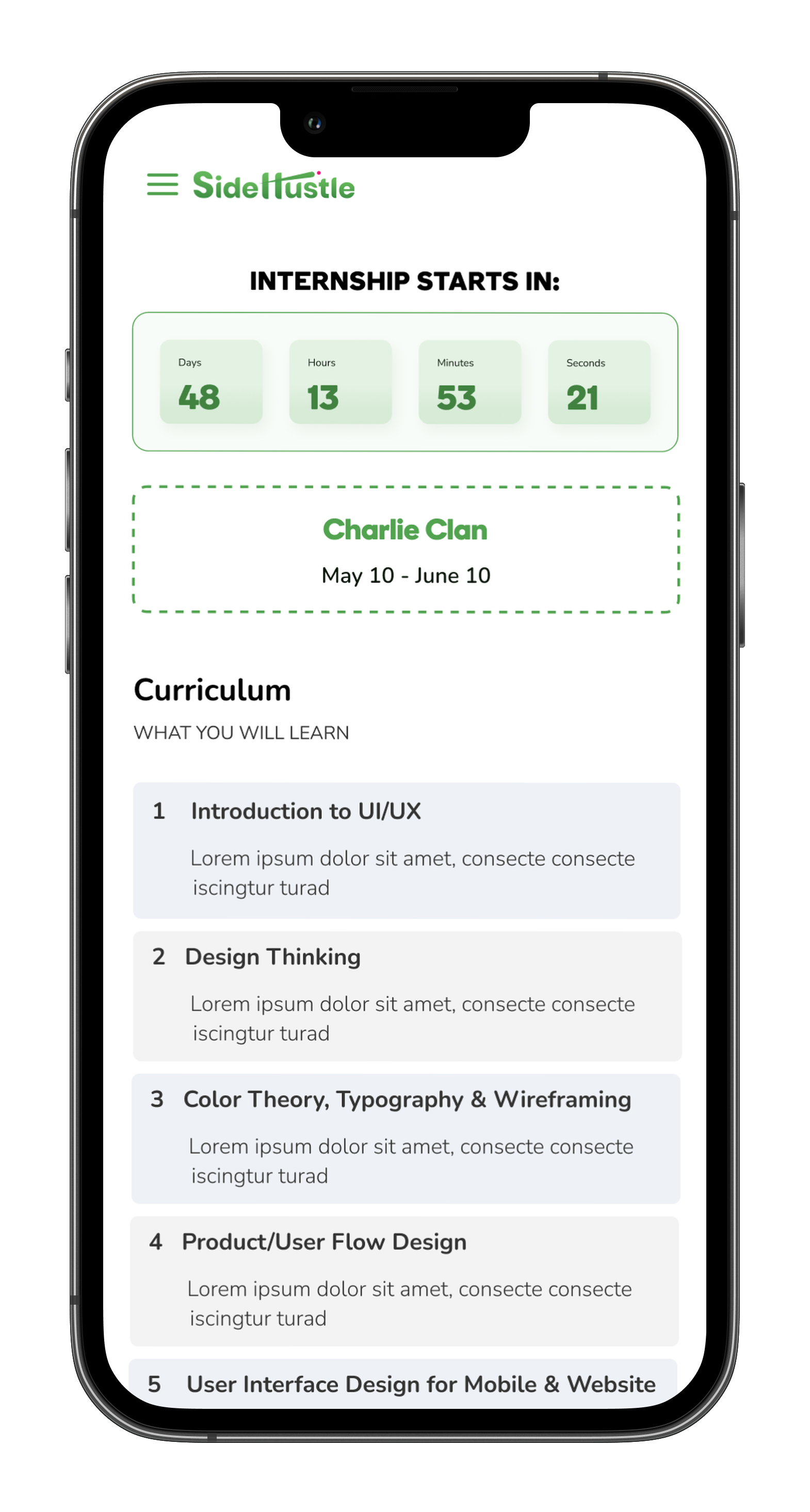
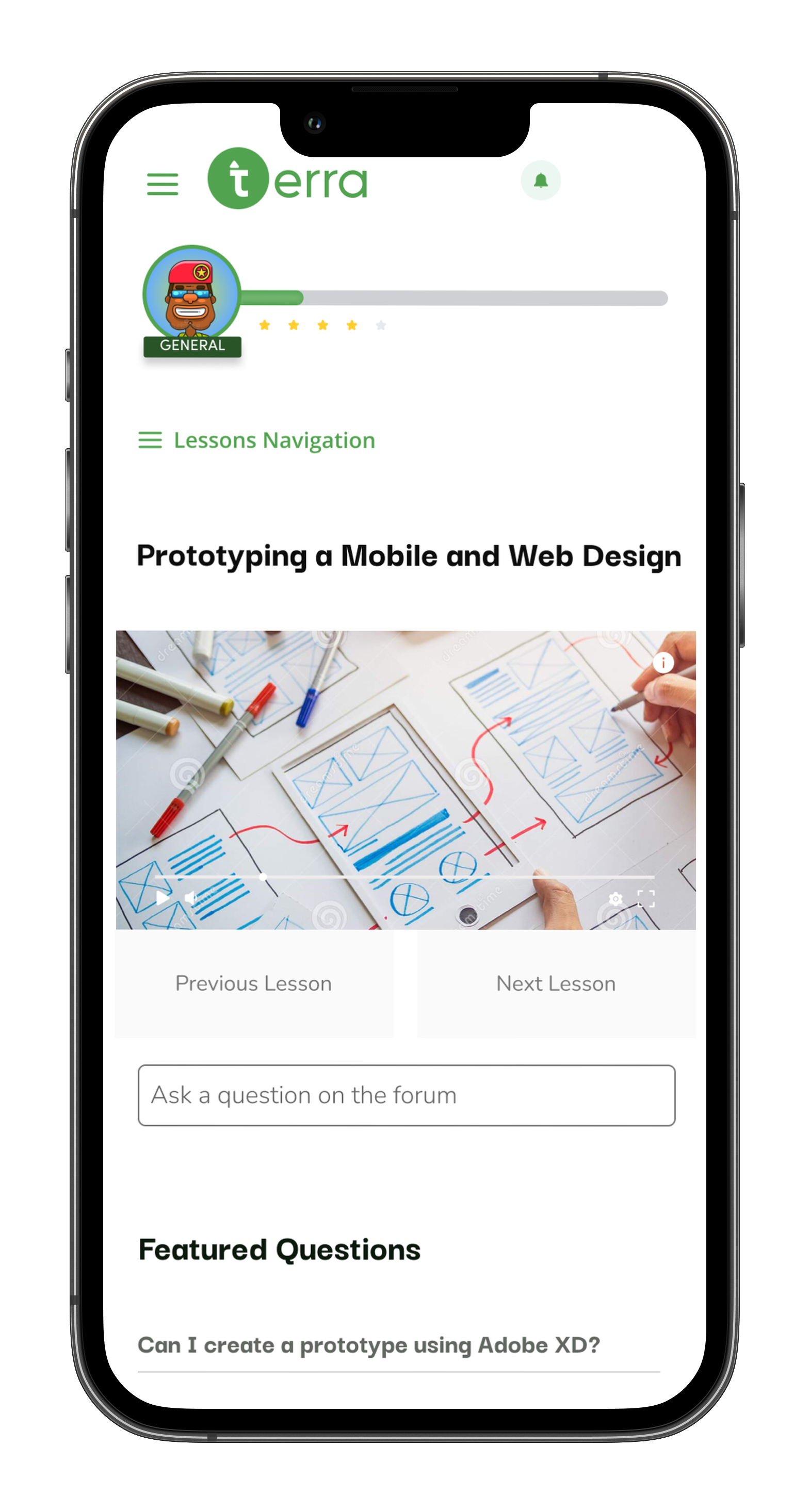
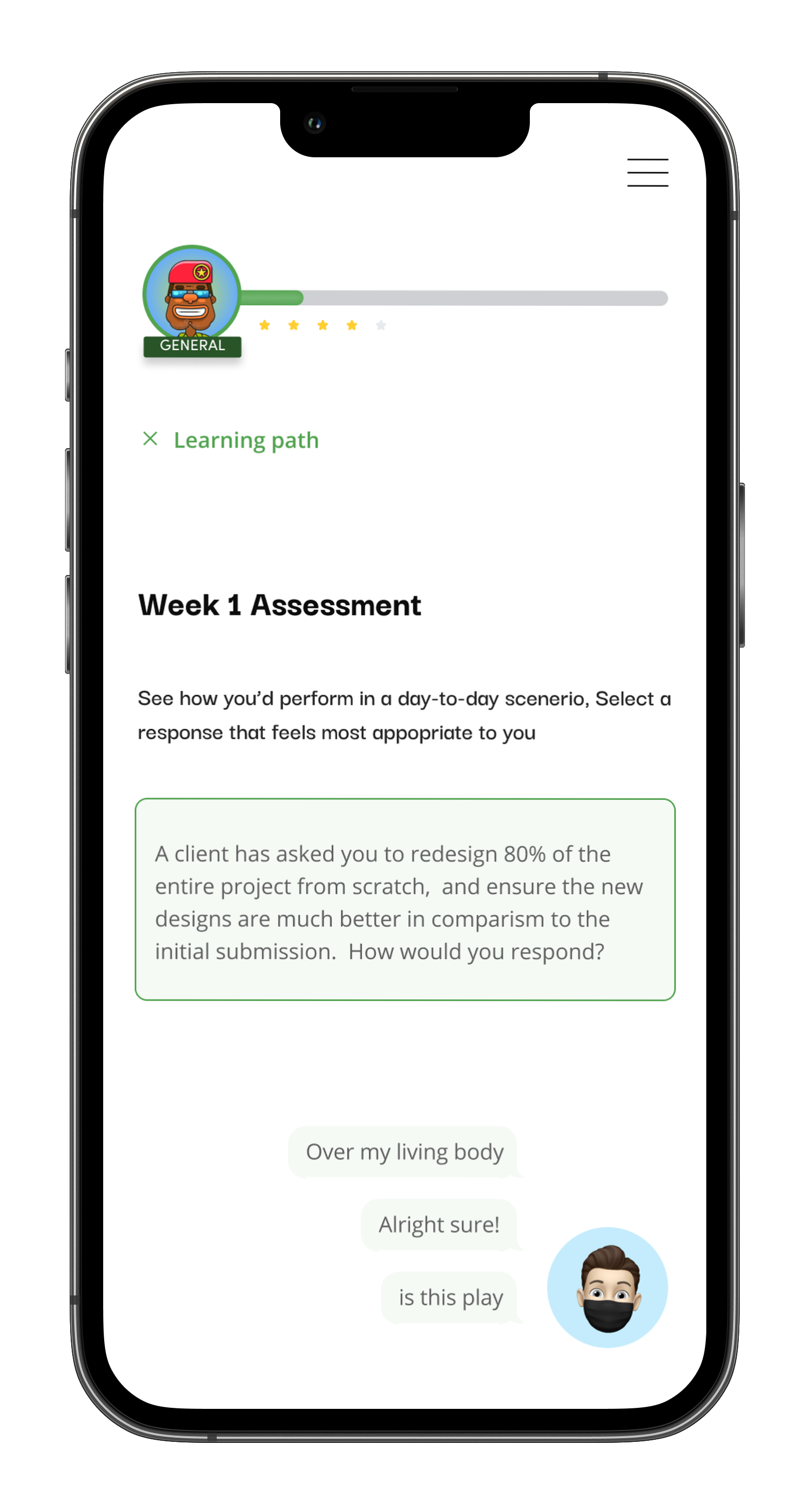
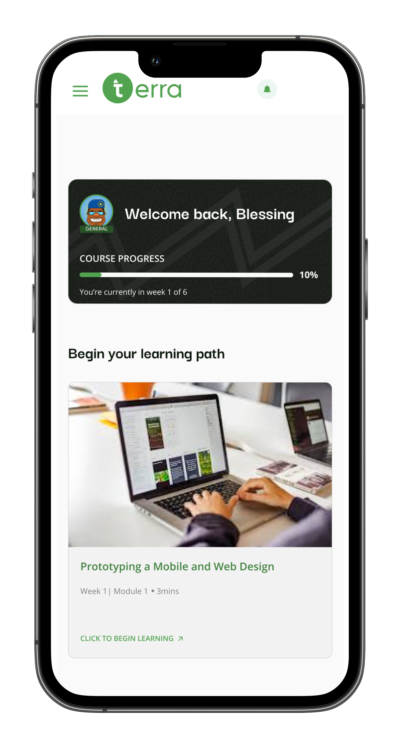
Mobile experience
Because interns often access learning materials on the go, the mobile experience was designed to be simple, clear, and easy to use on smaller screens. Key tasks like viewing courses, tracking progress, and continuing lessons were optimized for touch interaction and quick navigation, ensuring a smooth learning experience across devices.

Reflection
-Research uncovered the core pain points from the 4.0 Teams/email workflow.
-Building the LMS (5.0) addressed multiple workflow issues simultaneously: clarity, progress tracking, and resource access.
-Iterative testing ensured the platform was usable and aligned with user needs.
Future focus: gamification, personalized learning paths, mobile optimization.
Conclusion
The UX research and design for Terra Learning 5.0 successfully replaced a scattered Teams/email learning process with a centralized LMS. Interns can now access and complete courses efficiently, track progress, and engage with content, while mentors gain full visibility into learning. Every design decision was grounded in real user needs, resulting in a scalable, user-centered platform.